EN
Hot Foil on Lash Boxes: Gold, Silver or Laser (2026)
Foil is the only finish that changes the box, not the picture
A print change alters what the box says. Foil changes what the box is — because foil is not ink. It is a thin metallised film transferred onto the board by a heated die under pressure, and that single fact explains almost every constraint that follows.
Which is why the useful question is not "can we add gold?" (yes, almost always) but "what will the foil do to the box, and to the sample, and to the photograph?"
This article covers it on the smallest canvas we run: the single-pair paper box, one pair of lashes, a window, and a foil mark. Small boxes are the honest test, because there is no room to hide a foil that has been asked to do too much.
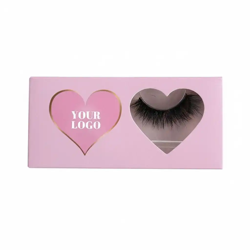
Gold foil — a hairline that frames the mark
Quick answer
| Question | Answer for this format |
|---|---|
| What foil actually is | A metallised film transferred by a heated die — a stamping pass, not an ink |
| What it costs | A die, a set-up, and one pass per foil colour — plus the film |
| The three finishes here | Gold, laser silver, frosted (sand) laser silver |
| What foil cannot do | Very fine hairlines, tiny isolated dots, or cross a crease without risk |
| The design rule | One element, one die, one pass |
| What to test on a sample | The crease, the rub, the tape, and the photograph |
The three finishes, and how each one behaves
Foil is often chosen from a colour card, which is the wrong way to choose it, because these three do not differ mainly in colour — they differ in how they behave when light moves.
Gold. A solid metallic with a warm tone. It reads consistently: on a shelf, in a phone photo, under a ring light. This is the finish that photographs closest to how it looks in the hand, which matters if your product images are the only place a customer will meet the box.
Laser silver. A holographic film that diffracts light into a rainbow which shifts with the viewing angle. It is the most striking of the three and the hardest to control. Two boxes from the same run can look different in the same photograph, and a single box can look different on two sides of the same shot. Beautiful in the hand, unpredictable in a listing.
Frosted laser silver (烫镭射砂银). The same diffraction, diffused into a grainy sparkle instead of a mirror. It scatters light rather than reflecting it, so it holds up better under bad retail lighting, hides fingerprints and small scuffs, and photographs far more consistently than plain laser.
The practical consequence for an e-commerce brand: laser silver sells on video and loses on stills; frosted laser silver does both adequately; gold does stills best. If your channel is a marketplace listing with one hero image, that ranking should decide the finish before the colour card does.
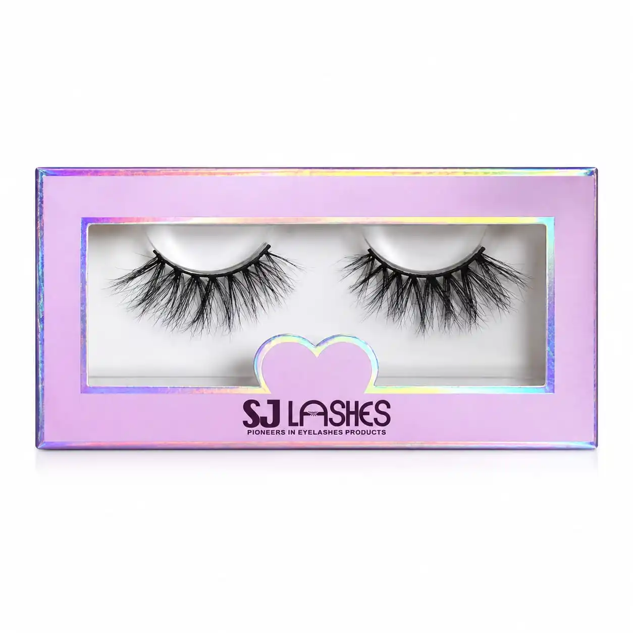
Laser silver — a rainbow that moves with the angle
The expensive mistake is foil near a fold, not foil itself
Here is the failure that costs the most and shows up last: foil that crosses a score line cracks.
The foil layer is metallic and thin. When the board is folded along a crease that runs under or through a foil area, the film has to stretch with the board, and it does not stretch — it fractures along the fold. On a small box, the crease is never far away, so this is not an edge case. It is the default risk.
The photograph above shows the competent answer: the gold frame keeps a deliberate margin on every side, and where the design needs to step around the logo, it steps with a notch rather than running to the panel edge. That margin is not timidity — it is the difference between a box that survives folding and one that arrives with a hairline crack across the metal.
Three ways to keep foil away from a crease:
- Margin. Keep the foil area back from every score. Ask your supplier for the margin they want, and design to it rather than negotiating after the proof.
- Notch instead of run. Where a frame has to change direction, a step or notch lets the foil stay inside the safe zone. The stepped frame here is a design decision made to respect the fold, not a decorative whim.
- Break the foil deliberately. If a mark genuinely must cross the fold, design it so the crossing looks intentional — a gap at the crease, or a motif that repeats on both sides of it.
If a supplier shows you a proof and not a folded sample, you have not seen the foil yet.
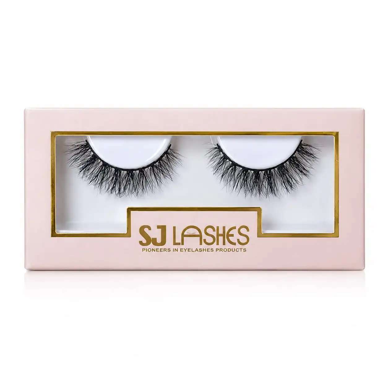
Gold foil — a stepped frame that keeps its distance from the fold
Fine lines, dots and filigree: the physical floor
Foil transfers through a die, and a die has a minimum feature size below which the transfer stops being reliable. Ask any supplier what happens under it and you will hear the same words: the line breaks up, or it fills in, or it only takes on some units.
Which puts a floor under how delicate a design can be, and this is where taste and process collide — because the most elegant foil details are often the ones closest to that floor.
Hairlines. A very thin stroke reads as luxury on screen and as a dotted, patchy line in production. If your mark has fine serifs or thin joins, expect the supplier to ask you to thicken them, and take that request seriously: they are not asking for a coarser design, they are telling you where the process stops.
Isolated dots. A dotted border — like the pin-dot rule running around the panel in the photograph below — is the most fragile thing you can ask for. Every dot is a separate transfer point with its own edge, so dots need enough area to take, and enough spacing that the film does not bridge between them. Done well it is exquisite; done marginally it reads as a printing defect.
Fine ornament. Filigree is the same problem at higher density, and it is where the difference between a good die and a cheap one shows. Dense fine detail needs a die cut to finer tolerance and a steadier press.
What to do about it: send the supplier your artwork before the design is signed off, and ask one question — "is any part of this below what you can hold?" A supplier who answers honestly will save you a reprint.
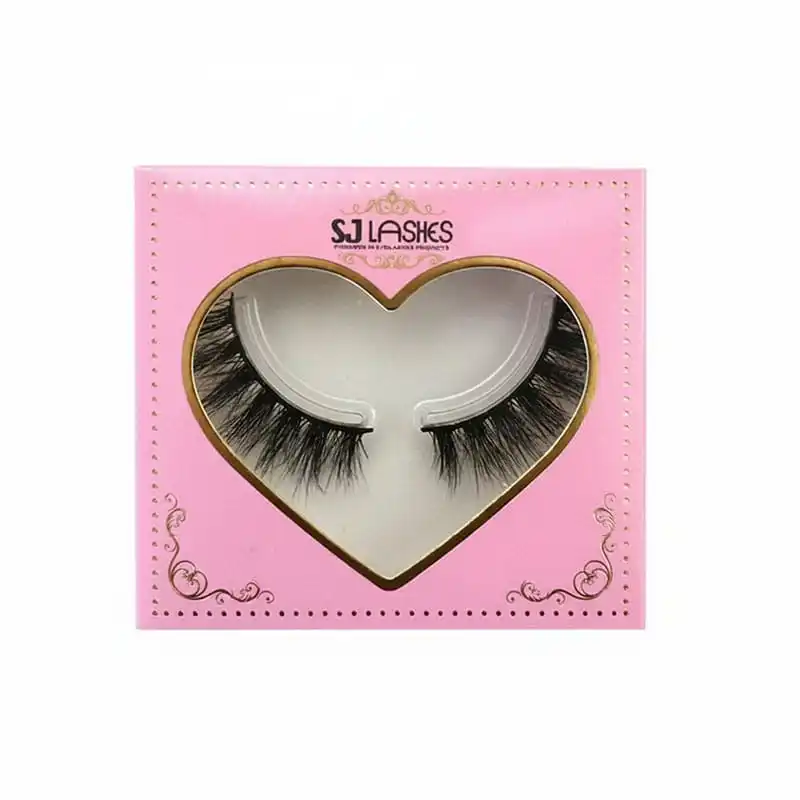
Gold foil — a dotted rule, the most fragile detail on the box
How much ornament one die can carry
There is a version of this box where the foil is a single border, and a version where the foil is a border plus four corners plus a wordmark plus two flourishes — and buyers often assume the second is simply "more expensive". It is, but not for the reason they think.
The die is priced once, and it is priced by area and by detail. A large simple shape and a small intricate one are not far apart in die cost; what separates them is how many transfers the press has to make cleanly and how much film the job consumes.
Which produces the counter-intuitive rule that governs good foil design on a small box: one element, one die, one pass. Put the metal on the thing you want remembered, and let everything else be print.
Look at the rose-gold example: the foil is a hairline around the window plus four corner flourishes plus the mark. All of it is one colour, one die, one pass — so the ornament costs almost nothing beyond the drawing. That is the efficient way to be ornate: many shapes, one colour.
The inefficient way is two foil colours. A gold frame and a silver mark means two dies, two passes, two set-ups, and a registration problem between them on a box that is only a few centimetres wide.
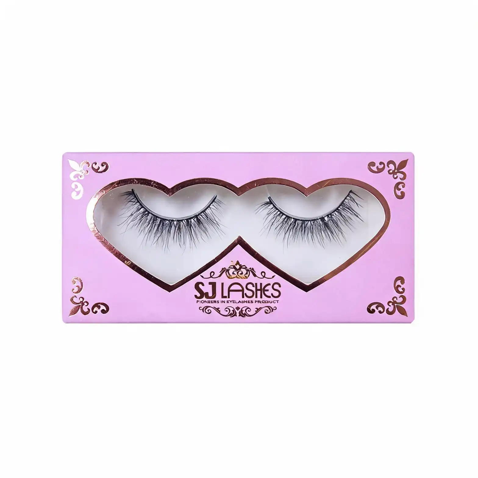
Rose gold foil — many shapes, one colour, one pass
What one element looks like in practice
The cleanest example in this set is almost the plainest: a pink box, a rectangular window, a wordmark in gold, and two small hearts in the opposite corners.
Everything metallic here is one colour and one die, and the design works because the foil is doing exactly one job — it is telling you where the brand is. The pink board does the atmosphere, the window does the product, the foil does the identity. Nothing is competing.
This is the design brief I would give any brand choosing foil for the first time:
- Pick one element to carry the metal. A wordmark, a monogram, a single rule around the aperture — one.
- Make it the element a customer would recognise if the box were the size of a thumbnail, because that is how it will appear in a marketplace listing.
- Let the second and third ideas be print. You lose nothing in perceived quality and you keep the die simple, which is what keeps the sample honest.
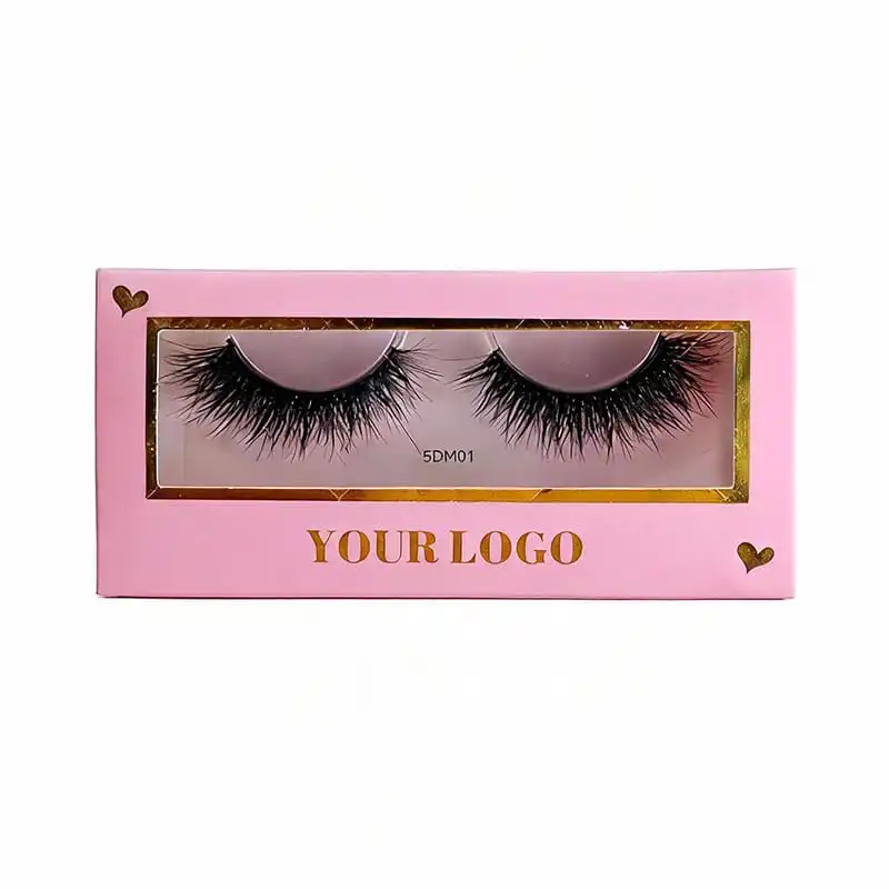
Gold foil — one colour, one die, one job
Line or band: how much foil you are actually buying
Two boxes can both be "foil" and sit at different ends of the cost scale, and the variable is area.
A line — the frame around a window, a hairline around a heart — uses very little film and stamps quickly. A band — a wide foil border filling the space between the window and the panel edge — uses several times the film for the same outline, and it needs the die to press evenly across a large area to avoid blotching or trapped air.
The frosted band above is the wide version, and it is the one that changes the character of the box: at that width the foil stops being an accent and becomes the surface. It also stops being forgiving, because any unevenness across a large area is visible, whereas on a hairline nobody sees it.
Two things worth knowing before you design a band:
- Large solid foil area on textured board is the hard case. The film has to conform to the board's surface; on an uncoated or grainy stock it will not fill completely, and the result reads as pinholes. If you want a wide foil area, ask what board the supplier recommends rather than choosing the stock first.
- A band competes with the window. On a small box, a wide foil border pulls the eye to the frame rather than the lashes. That can be the right call — on this box it makes a modest product look like a gift — but it is a decision, not a default.
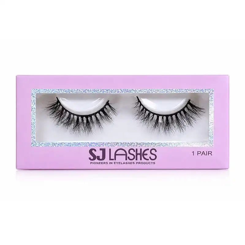
Frosted laser silver — a band, not a line
Consistency between units: the question nobody asks until the second batch
Foils vary between runs, and the more spectacular the foil, the more it varies. A laser film in particular reflects whatever is in front of it, so "matching the previous order" is a weaker promise than it sounds.
Ask this before you approve a finish: "if I reorder in six months, how close will the foil be to this sample?" For a solid gold the answer is usually "very close". For a laser film the honest answer is "close in character, not identical in appearance", because the diffraction pattern and the film batch both contribute.
Three practical consequences:
- Sign off on the physical sample, in your own light. A foil approved on a monitor is not approved. Look at it under shop lighting and in daylight, and hold it at a few angles.
- Photograph the sample, not the render. If the listing image will be a photo, the decision should be made from a photo. Laser silver is the finish most often chosen from a render and regretted in a still.
- For repeats, keep the foil reference. A supplier who still has the film reference and the die can match much more closely than one starting fresh.
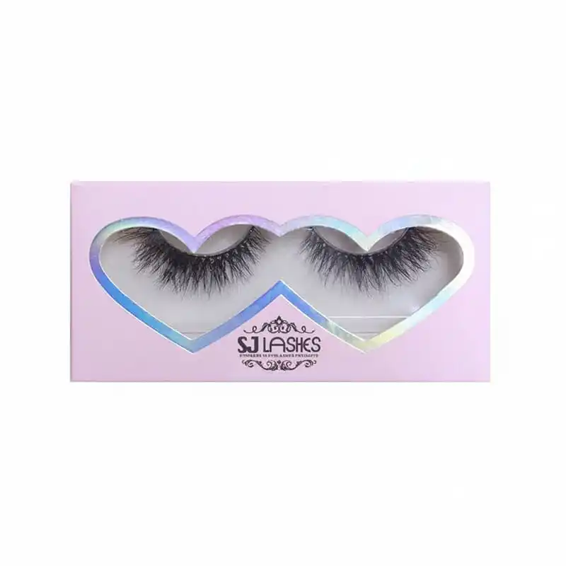
Laser silver — thinner outline, more of the board showing through
If the budget is tight, there are two cheaper answers
Hot foil is the brightest option and not always the right one. Before you accept a die cost, ask about these — a supplier who only quotes hot foil is either not listening or not equipped.
Metallic ink. A gold or silver ink printed like any other colour. No die, no separate pass, no crease risk, and the cost barely moves with quantity because it is just another plate. What you give up is depth: metallic ink sits flat on the board, reflects less, and on a dark or uncoated stock can read closer to grey or beige than to metal.
Cold foil. The film is transferred on press using an adhesive rather than a heated die. It handles large areas more comfortably and avoids a separate stamping set-up, and the trade-off is brightness — it generally reads less mirror-like than hot foil. Worth asking about specifically if you want a band rather than a line.
When hot foil is clearly right: small quantity of foil, high perceived value, a mark that has to look like metal in the hand, and a box where the foil is the only luxury signal. That is exactly this format — a single pair, a small box, one mark.
When it is clearly wrong: a large foil area on a low price point, or a design whose foil is so fine that half of it will not transfer reliably. In both cases you are paying for a die to produce defects.
Supplier scorecard
What to ask
- What is the minimum stroke width you can hold, and what is the minimum isolated dot?
- How much margin do you want between foil and every score line?
- Will the foil cross a fold anywhere, and if so how do you stop it cracking?
- Does the die cost change with foil area, and how much film will this job consume?
- Which board do you recommend for the foil area I want?
- Is the foil a stock film or a special order, and what is the lead time on it?
- If I reorder in six months, how close will the foil match?
- Can you quote hot foil, cold foil and metallic ink on the same artwork?
What to test on a sample
- Crease test. Fold and unfold the box along every score near the foil, then look along the fold at an angle. Cracking shows first as a fine bright line.
- Rub test. Rub the foil firmly with a thumb and then with a cloth. It should not dull or lift.
- Tape test. Apply adhesive tape over the foil, press, and pull. Film that lifts with the tape is film that will lift in a customer's hand.
- Angle test. Turn the box slowly through a full rotation. On laser film look for dead angles where the effect disappears — if the mark vanishes at a common viewing angle, it will vanish in a photo too.
- Batch test. Compare this sample against your previous order side by side, in daylight. If you cannot, keep a reference sample on file for next time.
- Photograph test. Shoot the sample on a phone in ordinary light. If the listing image will be a photo, judge the finish from a photo.
Quote checklist
- Box format and size, board grade and colour.
- Foil colour and type: gold, rose gold, silver, laser silver, frosted laser silver.
- Foil area: describe it as line or band, with dimensions if it is a band.
- Number of foil colours — and confirm it is one.
- Artwork: stroke widths, smallest dot, ornament density.
- Margin from every score line, and whether any foil crosses a fold.
- Die cost, film cost and set-up, quoted as separate lines.
- Whether metallic ink or cold foil was quoted as an alternative.
- Window and lash presentation on the same box.
- Carton and pallet configuration.
- Sampling quantity and lead time.
Request a foil sample from our lash box range
Compliance and honest claims
- "Gold foil" is a colour, not a metal. Metallic film is a metallised layer, not gold. Write gold foil, gold-toned, or rose gold; do not imply precious metal content, and do not let a marketplace listing describe it as real gold.
- Foil complicates a recyclability claim. A metallised layer on a paper box is not the same as plain board, and on a single-material claim the foil area is the part that has to be checked. Ask your supplier what the foil does to the pack's recyclability before you print a logo onto a claim.
- Do not put a compliance line in foil. Required text — warnings, net content, responsible party — should be printed, not stamped. Foil on fine type is the least legible and least reliable combination on the box.
- A registration-critical market language is a print job. If the box has to carry translated text, that is print artwork and it changes your layout, not your foil.
- Keep a reference sample. If you make a colour or finish claim in marketing, the physical sample on file is your evidence. Foil is the one component where "it looked different in the photo" is a real dispute.
Why SJ LASHES
Foil is a craftsman's process wearing a luxury label. Anyone can quote gold; the difference is whether the sample survives being folded and photographed.
- We check the artwork against the process before quoting. Stroke widths, isolated dots and ornament density are reviewed for what the die can actually hold — not approved and then discovered at the press.
- We design margins around every score. The stepped frame in this article exists because foil near a fold is a defect waiting to happen; that is a structural decision, made at drawing stage.
- We quote foil, cold foil and metallic ink on the same artwork when the budget is the constraint, so the choice is a comparison rather than a default.
- We hold foil references for repeats. A reorder six months later should look like a reorder, not a new SKU.
- Low minimums and physical samples. On a single-pair box there is nowhere to hide a bad transfer, so we would rather you judge it in the hand than on a screen.
👉Talk to us about foil on your lash box · See packaging options
Frequently asked questions
What is hot foil stamping? A metallised film transferred onto the board by a heated die under pressure. It is a stamping pass with its own die and set-up, not an ink printed with the rest of the artwork.
Which is better, gold foil or laser silver foil? It depends on where the box will be judged. Gold photographs most consistently and reads warm in the hand; laser silver is the most striking in video and the least predictable in a still image; frosted laser silver sits between them and hides scuffs best.
Why does my foil crack along the fold? Because the film does not stretch. Any foil area that crosses or sits too close to a score will fracture when the board is folded. The fix is margin, a notch, or a deliberate break in the design at the crease.
Can I have gold foil and silver foil on the same box? Yes, but each foil colour is a separate die and a separate pass, plus registration between them on a small panel. It is usually better to use one foil and let a printed colour carry the second accent.
Can the foil be very thin, like a hairline? Up to a floor. Below the die's minimum feature size the transfer becomes patchy or fills in. Send the artwork for review before sign-off and ask directly what cannot be held.
Is foil more expensive than printing? Per unit it is, because of the die and the set-up, and the gap narrows as quantity rises. At low volumes, metallic ink or cold foil is often the better buy — ask for both on the same artwork.
Will a reorder match my first batch? Gold and solid silvers match closely. Laser films match in character more than in exact appearance, because the diffraction pattern and the film batch both vary. Keep a reference sample.
Can I put the required label text in foil? Don't. Fine type is where foil is least legible and least reliable. Keep compliance text in print.
The takeaway
Foil is the cheapest way to make a small box look expensive, and the easiest way to create a defect that only appears after folding. The three rules that prevent it are unglamorous: one element, one die, one pass; keep the metal away from every crease; and judge the finish from a folded sample in your own light, not from a proof.
Choose gold if the box will mostly be seen as a photograph. Choose laser silver if it will mostly be seen moving. Choose frosted laser silver if it has to survive both, and a shop floor.
👉Related reading: single pair lash gift box · the three most popular lash box types