EN

Black Lash Boxes: When Foil Is the Only Colour (2026)
On a white box, foil is a bonus. On a black box, it is the system.
Most lash boxes are white or cream, and foil on them behaves like jewellery: the print does the talking, the foil adds a highlight. Remove the foil and the box still works.
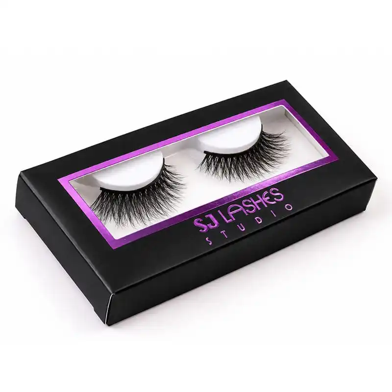
This box is the inverse. Matt black board, no white panel, and one magenta frame around the window plus the wordmark — all of it foil. Take the foil away and there is almost nothing left: a black rectangle with a hole in it.
Which means the artwork decisions here are not "where do we add foil". They are "what carries the colour", and the answer has consequences for the die, the registration, the plate count and the QC — none of which a white-box brief prepares you for.
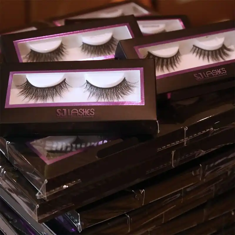
Image title: One Colour, Doing All the Work
Quick answer
| Question | Answer on this box |
|---|---|
| What does the foil do? | Draws the window, carries the brand colour, and frames the product — three jobs a printed panel does on a white box |
| Is pink-purple foil "metallic"? | No. It is a pigment foil: colour without mirror. It reads flat and brand-true rather than shiny |
| How many foil passes? | One. Frame and wordmark are the same colour, so one die and one pass |
| What is hardest to control? | Registration between the die-cut window, the foil frame and the white tray — visible against black |
| Can the same die make other colours? | Yes — the die and window stay, the foil colour changes. That is the commercial point |
| What decides whether the foil transfers cleanly? | Four settings: temperature, pressure, dwell, and foil advance. Each owns a different defect |
Coloured foil is not metallic foil
This is the first thing buyers misjudge, because both are called "foil". They are different products with different jobs.
Metallic foil — gold, silver, and the laser variants — carries a reflective layer. It reads as metal: it catches light, it shifts with angle, and it signals luxury by association.
Pigment foil — this magenta, and most brand-colour foils — carries colour without the mirror. It reads as dense, flat, saturated colour laid on the board, closer to a screen-printed ink than to gold.
Three practical consequences:
It can hit a brand colour that metallic cannot. If your identity is a specific magenta, no metallic foil will give it to you. Pigment foil is how you get colour-as-metal-free-foil.
It will not read as "luxury" on its own. Gold on black says expensive without help. Magenta on black says brand, which is a different and often more useful message — but it does not do the work for you. The frame has to be well drawn, because there is no sparkle covering for a lazy line.
It needs more width than a metallic hairline. A fine metallic line catches enough light to register. A fine pigmented line on black just disappears. Ask your supplier what minimum width they will guarantee in a pigment foil on a dark board, which is a different number from the metal case.
How hot foil actually transfers
Worth understanding the mechanism, because every constraint in this article comes out of it.
The foil is a film with four layers. A carrier film — usually PET — holds, in order: a release coat, the colour or metallised layer, and an adhesive size. Nothing is printed. The stack is manufactured, and the foil is a consumable.
The transfer is mechanical. A heated metal die — the relief, with the artwork standing proud — presses the film against the board. Three things happen at once: the heat softens the release coat so the layer can let go of the carrier, the heat activates the adhesive size so it grabs the board, and the pressure holds the sandwich together for a fraction of a second. Then the die lifts, the carrier film peels away, and the layer stays on the board only where the die touched it.
So the process has exactly four settings, and each one owns a specific defect:
| Setting | Too little | Too much |
|---|---|---|
| Temperature | Patchy transfer, speckle, foil left on the carrier | Halo beyond the die edge, blistered or dull surface |
| Pressure | Missing fine detail, gaps on textured board | Die mark telegraphing into the board, crushed flutes, visible indent on the back |
| Dwell time | Partial transfer on the first units, drifting across the run | Halo, slower running, heat build-up in the die |
| Foil advance / tension | Re-using spent foil — gaps that repeat at a regular pitch | Wasted foil, wrinkles that transfer as creases |
Two consequences that matter to a buyer:
The die is a relief, so the artwork is a set of raised shapes. What you send is not a picture — it is a toolpath. Areas smaller than the die can etch will not exist; tight gaps between two shapes will fill in; and a hairline is a physical wall on a metal plate, not a vector stroke.
Black board is the least forgiving ground. Every missed square millimetre has no colour behind it to hide in — the defect reads as black on magenta, and it reads from a metre away. On white board the same miss disappears.
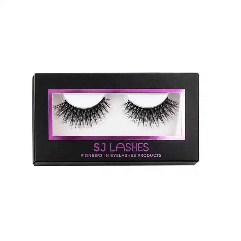
Image title: Where Every Missed Millimetre Shows
Three layers have to line up, and black reports every error
A windowed lash box is a stack: die-cut window in the board → foil frame around that window → white tray behind it holding the pair.
On a white box, a millimetre of drift between those three hides, because everything is the same tone. On black it does not. A foil frame that sits half a millimetre off its window shows as a bright sliver on one edge and a dark gap on the other — and the customer reads that as a cheap box, because it looks like something was misaligned, which it was.
What causes the drift, in order of likelihood:
The foil frame is drawn to the artwork, not to the die. The frame must be offset from the die line by a fixed clearance, so that both the registration tolerance and the die's own cut variance sit inside the dark area rather than on the edge.
The tray floats. A tray that is a loose fit inside the box shifts, and since the tray is white and the window is tight, the pair drifts inside the frame. The tray needs lateral location, not just a cavity.
The frame is drawn too tight to the window. If the foil edge and the cut edge are meant to touch, every unit will show a hairline of black or a hairline of magenta, alternating. Give the frame a small overlap onto the board, or a deliberate gap — but decide which, and hold it.
The practical test: open a shipping carton at random, not the top box. Take ten units, look at all four edges of the frame, and count how many are visually even. If the top-of-carton sample is good and the bottom is not, the problem is handling, not artwork.
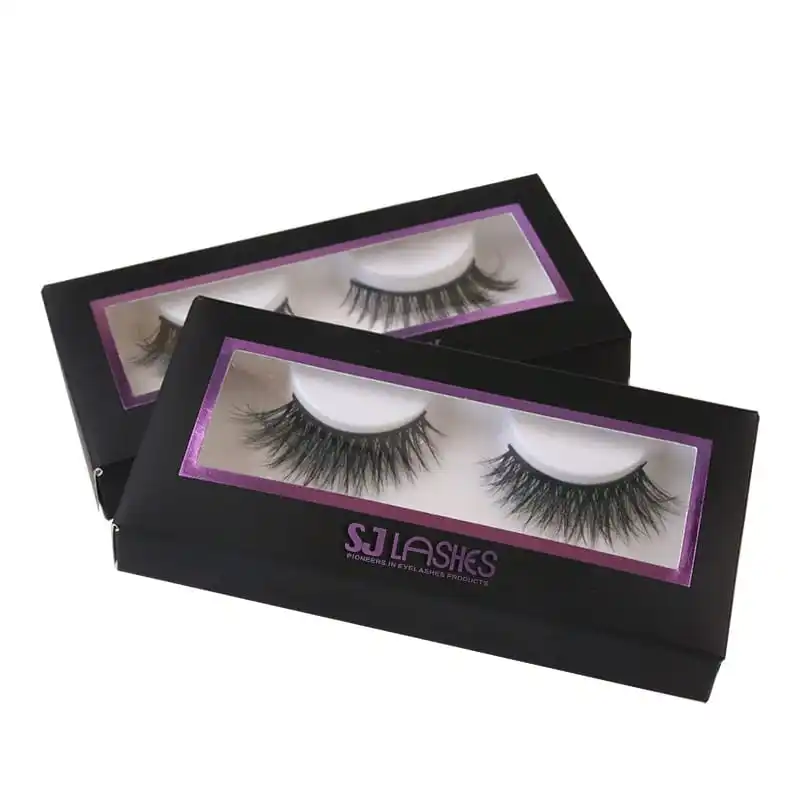
Image title: Every Edge Is a Decision
One die, five colourways — the real commercial value
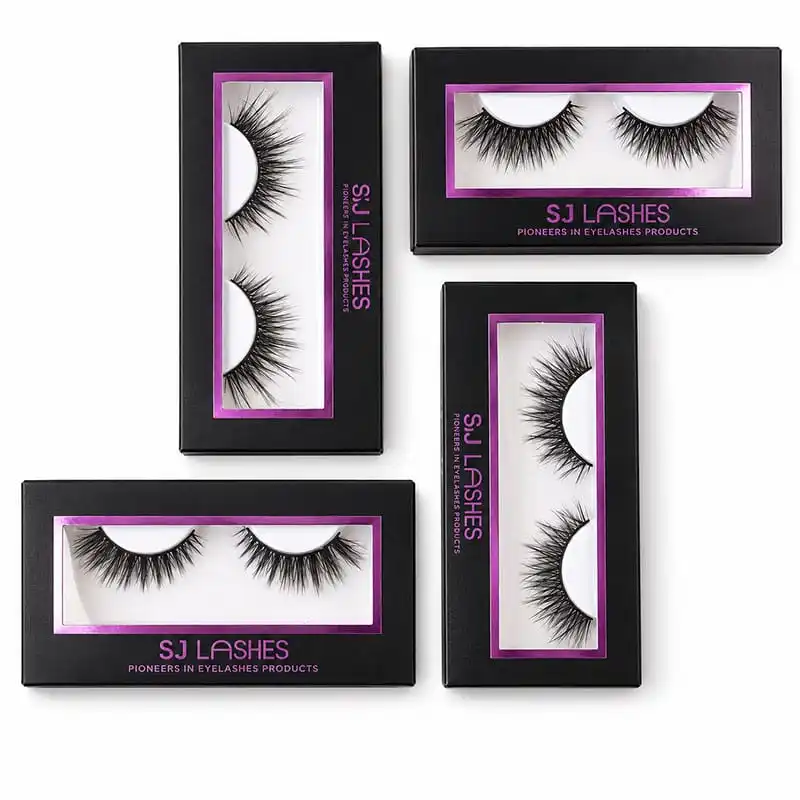
Here is the part worth designing around, and it is visible in the range shot: the same box, the same window, the same frame geometry, in black with magenta foil, pink with gold, white with gold, lilac with gold, burgundy with gold.
The die is fixed. The colour is the variable.
That single fact changes what a private-label programme costs. A brand that wants four seasonal colourways does not pay for four dies and four structural proofs — it pays for one die and four foil runs. Which also means:
- A new colourway is a print decision, not a project. It can ship in the time it takes to approve a foil swatch.
- The frame geometry must be colour-agnostic. If the artwork is tuned so that black-and-magenta looks right, the same line will look thicker on a pastel box and thinner on burgundy. Draw the frame to a width that survives all five grounds, then check it on each.
- Foil colour and board colour are one decision. Magenta on black and magenta on pink are two different designs. The pair that matters is not "which foil" but "which foil on which board" — and it should be chosen looking at them together, not from a foil chip.
What does not change across the range: the tray, the window geometry, the folded blank. So a multi-colourway programme shares tooling, QC and packing spec — which is exactly why it is cheaper than it looks.
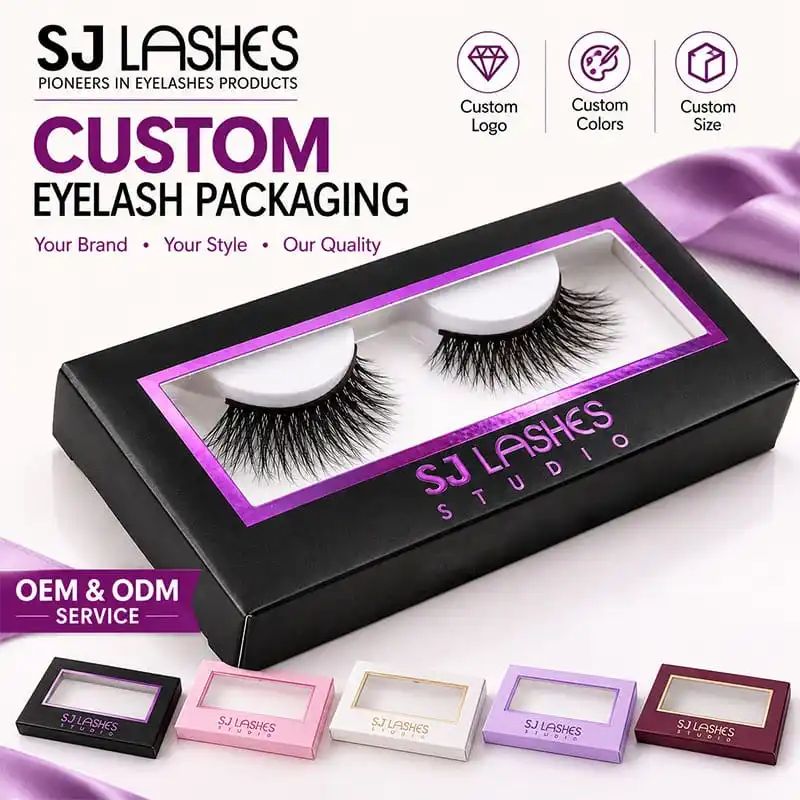
Image title: One Die, Five Grounds
The tray is doing more than holding the pair
Inside the black box sits a moulded white tray with two curved beds, one per lash. It reads as a minor component and it is doing three jobs.
It is the contrast surface. Black box, black lashes — without the white tray the product would be invisible through the window. The tray is what makes the window work at all. On a black box, the tray is not packaging, it is lighting.
It holds the curve. The beds are shaped to the lash band's natural arc, so the pair sits in its own curvature instead of being pressed flat. A flat tray forces a strip lash to straighten, and a straightened band has to be re-curved before wear.
It centres the product in the frame. The pair's position relative to the magenta frame is a design decision — the tray is what enforces it.
The one thing to check: that the tray is white and stays white. A tray in a slightly warm or grey tone will make the lashes look dull, and against a saturated magenta frame it will read as dirty. Ask for the tray's material and colour target in writing, and check a tray from the bottom of the carton.
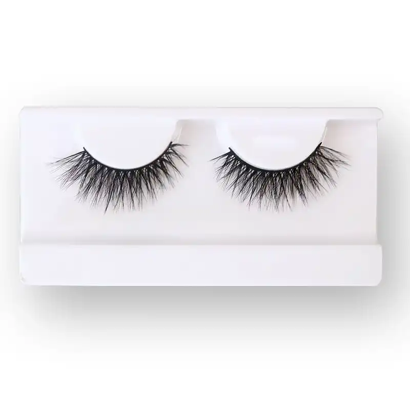
Image title: The Part That Makes the Window Work
Landscape or portrait: decide before the die
The range includes both orientations of the same idea — a landscape box with the pair side by side, and a portrait box with the pair stacked vertically, wordmark rotated to run down the side.
They are not the same product. They answer different shelves:
Landscape reads like a lash box: the pair lies horizontally, matching how lashes are worn and how they are photographed. It suits a counter display and any pack where the pair is the hero.
Portrait is a pegboard format. It takes less shelf width, hangs on a hook, and puts the two lashes into a vertical rhythm that reads well in a dense display. It costs you the "both eyes at once" reading.
The decision has to be made with the die, and that is the whole warning. Rotating the format later is not a layout change — it is a new die, a new tray tool and a new folded blank, because the window and the tray are both cut to the orientation. Choose by how it will be merchandised, not by which looks better in a render.
One thing that transfers free: the frame geometry and the foil width. If the frame works at landscape proportions it will usually work rotated, so a brand can carry both formats without redesigning the look — which is the cheapest way to serve a peg account and a counter account at once.
Supplier scorecard
What to ask
- Which foil is this — pigment or metallic — and what is its minimum guaranteed line width on black?
- Is the frame offset from the die line, and by how much?
- How is the tray located laterally inside the box?
- What board and finish is the black, and does it scuff at the fold?
- One die for all colourways — confirm, and confirm the window geometry is shared.
- Which elements are foiled, and how many passes?
- Tray material and colour target, in writing.
- What temperature, pressure and dwell are you running, and what is your minimum line width on black?
- Carton configuration, and how many units per inner.
What to test on samples
- Ten from the bottom of a carton. Check all four frame edges on each. Count the uneven ones.
- Fold test. Open and close fifty times. Black coated board shows fold wear as a light line — the most common way a premium box starts looking used.
- Scuff test. Rub the black surface with a thumb and with a tissue. Matte black marks; ask what the finish is and whether it can be improved without going gloss.
- Foil rub. Rub the frame with a dry tissue. Pigment foil on a dark ground should not transfer.
- Registration on the second pass if there is one — measure, do not eyeball.
- Tray whiteness under daylight, not studio light.
- Shrink-wrap check if the bulk pack is wrapped: film tension can bow a light box and make the frame look crooked.
Quote checklist
- Box format: landscape or portrait, with dimensions.
- Board and the black finish specification.
- Foil: pigment or metallic; colour reference; number of passes; which elements.
- Window die and the frame offset.
- Tray: material, colour, cavity, location method.
- Inner: card, film, or nothing.
- Colourways requested, and whether they share the die.
- Print panel for the compliance block: back, side, or insert card.
- Packing: units per inner, per carton, shrink wrap or not.
- Samples: a colourway set, not one box; plus a carton-bottom draw.
Compliance and honest claims
- A black foil-only front leaves nowhere for required text. Whatever the market, mandatory statements need a printed panel, an insert card or a base label. Decide that at artwork stage, not after the print run.
- A black box is not a place to hide mandatory text. If a required statement only exists in white-on-black small type, it is technically present and practically unreadable. Legibility is part of compliance.
- Foil is a colour, not a metal. Pigment foil is pigment. Do not describe it as metallic, and do not imply precious content.
- "Custom colours" means what the range shows. If you advertise five colourways, ship five — and keep the swatches that define them.
- Recyclability. Black board plus foil plus a plastic window plus a moulded tray is a multi-material pack. Any environmental claim has to cover all four, and the window and tray are usually the parts that fail a single-material claim.
- Net quantity. Whatever the box or the insert says must match what is actually inside, including a pair count if you state one.
Why SJ LASHES
A black foil box is judged on the things a render cannot show: whether the frame is even on the box from the bottom of the carton, whether the black still looks black after handling, and whether the tray is still white.
- We build the range on one die. Colourways share the window and the tray, so a new colour is a print run, not a project.
- We treat the frame as a registration drawing, with an offset from the die line, rather than as decoration placed by eye.
- We test from the bottom of the carton, because that is where the customer's first impression actually comes from.
- We tell you which shot will fail before the die is cut — a hairline, a filled-in gap or a coloured foil that dies on black is a proof-stage conversation, not a reprint.
- We make trays to a colour target, not "white" as an assumption.
- Low minimums on colourways, so a brand can test a ground before committing to it.
FAQ
Is magenta foil metallic? No. It is a pigment foil: colour without a mirror finish. That is why it reads as brand colour rather than as metal.
Can I get this exact foil colour matched to my Pantone? Approximately. Foil stock comes in a range, not in infinite matches. Approve a foil swatch on your actual board, not a chip on white.
Why does the frame look uneven on some units? Three usual causes: the frame is drawn to the artwork instead of offset from the die line, the tray floats, or the frame is drawn to touch the window edge. All three are fixable at artwork stage.
Can the same die really run five colours? Yes — the die and window are shared, the foil and board change. That is why a colour range is cheaper than it appears, as long as the frame is drawn to survive every ground.
Should I pick landscape or portrait? By how it will be merchandised. Landscape for counter and shelf, portrait for pegboard. It is a die decision, so make it before tooling.
Does the black box cost more than white? Usually yes, at the board and finishing stage, and it also raises QC expectations because marks and misregistration show. Price it with the QC in mind, not just the material.
Why does the foil look patchy on the second carton and fine on the first? That is the four settings drifting — usually temperature falling or foil not advancing. Ask for the settings in writing and check the tenth carton, not the first.
The takeaway
On a white box, foil is a highlight. On this box, foil is the entire graphic system, and that single change reorganises the brief: one pigment foil doing the work of a printed panel, a frame drawn to a die rather than to a mood, a white tray acting as the light source, and a die that stays put while the colourways move around it.
Get those four right and a black box looks expensive for the right reason. Get the frame offset wrong and it looks cheap for a reason the customer cannot name but will feel.
👉Further reading: Hot foil on lash boxes: gold, silver or laser · Custom segment lash cards