EN

Lash Glue Labels: Matte Gold Foil on Black (2026 Guide)
There is no box here — there are three layers
Most lash packaging articles are about cartons. This one cannot be, because this product does not ship in one: the bottle is the pack.
That leaves three layers doing three different jobs, and confusing them is where the money is wasted.
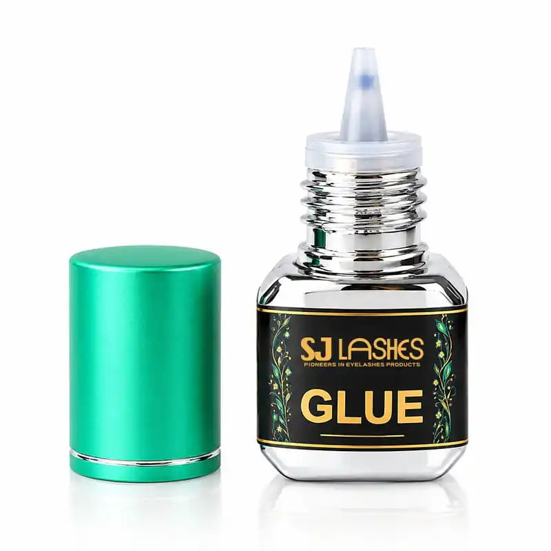
The bottle is the product — glass, with a squared body, a ribbed metallic neck and a fine nozzle tip. Its job is to hold a reactive liquid and dispense a controlled drop.
The wrap label is the brand. Black stock, matte gold foil, a botanical ornament in the product's own colour. Its job is to be read at 30mm wide.
The aluminium pouch is the barrier. Its job is to keep moisture and light away from a glue that cures on both.
Which means the label is not decoration on a bottle. It is the entire brand surface — the only place a customer reads who made this, what it cures in, and whether to trust it.
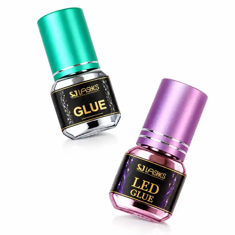
Image title: Same bottle, two products, one label system
Quick answer
| Question | Answer for this pack |
|---|---|
| What is the foil doing? | Carrying the wordmark and the product name — nothing else |
| Why matte gold, not bright gold? | Matteness reads as "old gold" on black; bright gold reads as gift-wrap |
| Where does the foil fail? | Thin rules and the fine ornament — the two things that look best in a render |
| What breaks it in the field? | The corner radius of a squared bottle, and cap-on-cap scuffing when packed densely |
| Is the pouch optional? | No. It is the barrier; the label is the branding |
Why matte gold only works on black
Foil comes in finishes, and the finish is the design decision — not the colour.
Bright gold is a mirror. It reflects the room, so it takes its colour from its surroundings: warm near a window, grey under a tube light, almost white in a phone flash. Photographs beautifully, changes constantly.
Matte gold is a diffuser. The surface scatters, so it holds its own tone. It reads as old gold, brass, antique — quiet rather than festive. Less sparkle, more weight.
That difference decides the substrate. Matte gold on a light ground reads beige. On cream stock, the same foil looks like a warm brown print, and the "metal" cue disappears entirely. On black, it reads as metal straight away, because the only contrast available is the foil's own brightness.
So the black label is not a brand preference. It is the condition matte gold requires.
What survives at 30mm
This label is small, and it asks the foil to do five different things. Ranked by how reliably each one transfers:
1. A fat wordmark — safe. "GLUE" is set heavy, in a wide face. Plenty of area per stroke, plenty of margin. This is what foil is for.
2. The brand line above it — at the limit. "SJ LASHES" is set much lighter, and above it sits a line of small caps. Both are near the floor of what a die can hold. They will transfer, but they are the first thing to go patchy when the press drifts.
3. Thin rules above and below — risky. A hairline rule is a hairline wall on a metal die, and any gap in transfer reads as a broken line. On black, a broken gold rule looks like a printing error, not a texture.
4. The botanical ornament — the clever part. Look closely and the ornament is not all foil: the stems and dots are gold, the leaves are printed in the product's own colour. That is the right call, and it is the single best decision on this label.
A fine leaf at this size would be a defect farm — too small to hold an edge, too detailed to fill. Printing it means the ornament keeps its richness while the foil only carries what foil is good at. Foil for type, ink for ornament.
5. The nozzle end — do not put foil there. The label stops short of the neck for a reason. Anywhere the customer grips, foil will polish, scuff and dull. Matte foil hides this better than mirror, but it does not escape it.
The practical rule: give the foil one job and let print do everything else. Every additional foil element on a label this size is another chance of a broken stroke in a batch of ten thousand.
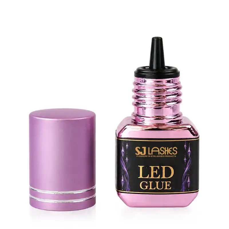
Image title: The label stops before the hand does
The corners of a square bottle
Here is the failure nobody prices in. The body of this bottle is squared with rounded corners — not round. A wrap label on it does not follow one gentle curve; it goes flat, turns through a radius, goes flat again.
The label is foiled flat, then applied. So the foil is asked to bend through that corner radius afterwards, and foil that is asked to bend does what foil does: it crazes — micro-cracks that read as a dull, whitened patch, usually first on the two corners facing the customer.
Three ways to handle it, in order of cost:
- Keep the foil on the flats. The centre of each face is safe; the corner radius is not. This is why the label is laid out with type in the middle and ornament drifting toward the edges — and why the ornament is print, not foil.
- Wrap a slightly larger radius. A softer corner costs nothing at the glass stage and removes most of the crazing.
- Accept it as texture — only if you have looked at a real bottle under real light first. On a small label at arm's length, slight dulling at a corner is invisible. In a macro product shot, it is the first thing a customer zooms into.
The test that settles it: label ten bottles, leave them at room temperature for a week, then look at the corners with a raking light. Crazing appears after the label has relaxed, not on the day it is applied.
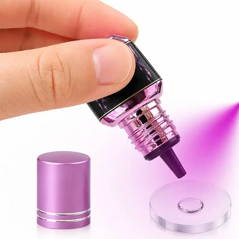
Image title: Flat, radius, flat — and the foil has to follow
The pouch is the packaging, and the bottle is the product
It looks like the wrong way round, and it is the most important thing to understand about this category.
A lash adhesive cures on contact with moisture, and degrades under light and heat. A glass bottle with a foil label does nothing about either. The aluminium pouch does — it is a barrier laminate, and it is what lets the bottle sit in a warehouse for months and still open wet.
That produces a division of labour worth quoting correctly:
- The pouch carries the functional label. Batch, dates, ingredients, warnings, barcode, QR — the block of data that must be legible and complete. In these photographs that block sits on a white panel on the pouch, next to the foiled brand panel.
- The bottle carries the brand. Wordmark, product name, and the colour code.
- Neither can substitute for the other. A beautiful label on a bottle with no barrier around it arrives as a hardened tube.
What that means commercially: if you are comparing quotes, compare the pouch. The difference between a proper barrier laminate and a thin metallised film is a few cents and a warehouse full of returns.
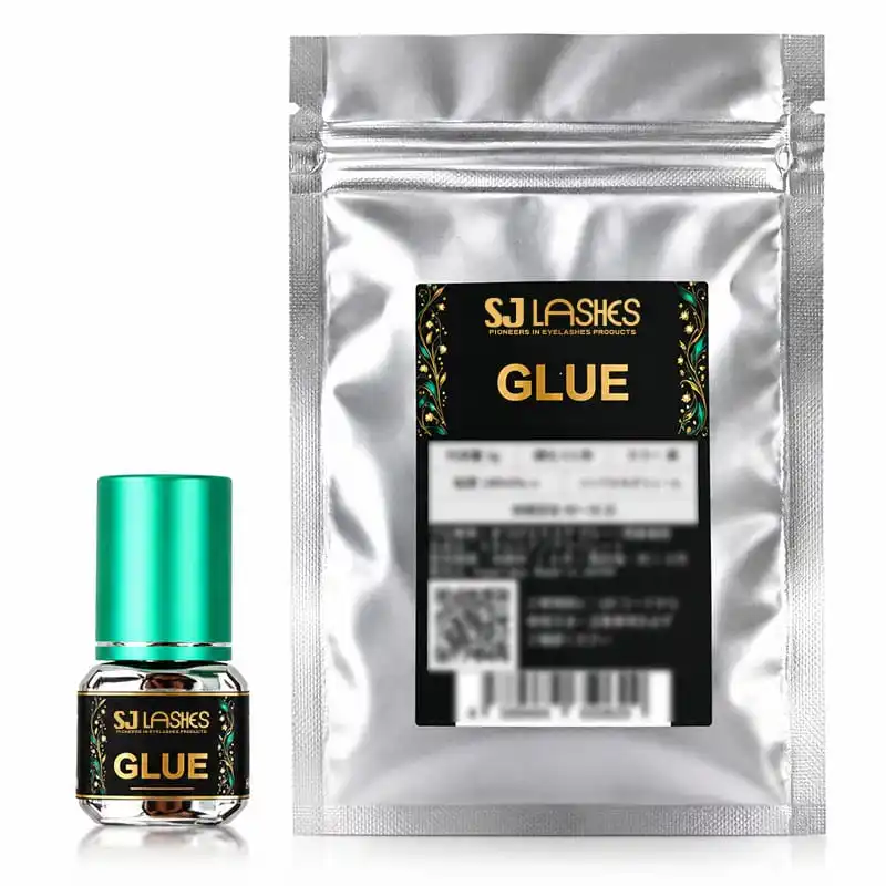
Image title: Two labels, two jobs
Dense packing is a scuff machine
"密排" — packed tight — is the right choice for freight cost and the wrong one for finish, and the conflict is easy to miss because it only shows after the carton has travelled.
The mechanism: the cap is the tallest, widest and most finished part of this bottle. Its surface is metallic — mirror-like on the purple, satin on the green — and on the ribbed neck the finish is even more exposed. Packed densely, caps touch caps, and every vibration in transit is a small abrasion. It shows as dull patches on a mirror, and it always appears on whichever surface faces the outside of the block.
What to do, in order of cost:
- Cap-up, one layer, divider between rows. The cheapest real fix: keep finished surfaces from touching.
- Moulded tray with individual pockets. Best protection, costs a mould and cube space.
- Individual poly bag. Effective, adds labour and a plastic layer per unit.
- Reduce density slightly. Sometimes one millimetre of air per bottle is cheaper than any of the above.
The test: pack, seal, run the carton across a rough floor for ten minutes, open it, and look at the caps under a light — not at the labels, at the caps. That is where dense packing shows first.
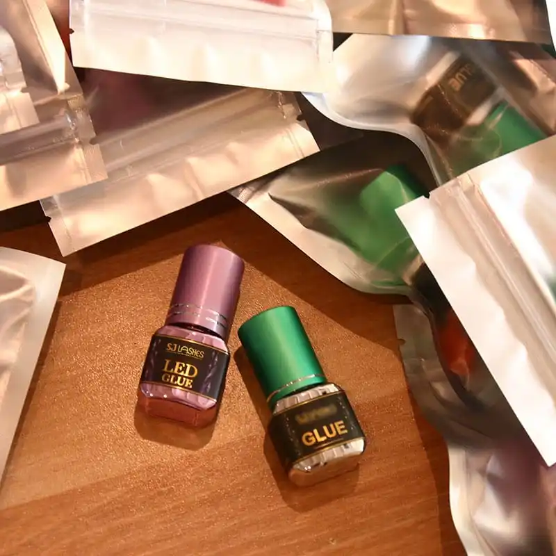
Image title: Everything here touches something
Two SKUs, one colour code — and it is half a system
The purple is the LED glue; the green is the 0.5-second glue. Same bottle, same label, same foil — and the difference is the cap colour plus the word LED on the label.
What works: colour-on-cap is the single most reliable differentiator you can put on a small cylinder, because it is visible before anything is read, at any angle, through a pouch window. It also lets the ornament carry the same colour, so the label and the cap agree. That coherence is why the two bottles look like a family rather than two products.
What is missing: colour is the only pre-reading cue. Under warm shop light purple and green separate well; under a phone torch at night, less so. Add to that a cap colour that is never quite the same between two production runs, and the whole system rests on a shade.
Three cheap additions, in order:
- Keep the word. "LED" is already there. Set it in a different weight from "GLUE" so the two lines read as a spec, not as one phrase.
- Add one printed mark — a dot, a stripe, a number. Print, not foil; it costs nothing and survives colour drift.
- Match the ornament colour to the cap, permanently. If a cap shifts shade, the ornament shifts with it and the pack still looks intentional.
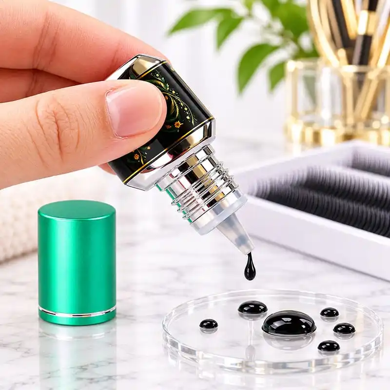
Image title: The colour does the work before the type does
Supplier scorecard
What to ask
- Which foil finish — matte, satin or bright gold — and can you show all three on my black stock?
- What is your minimum line width and minimum isolated dot on a label this size?
- Which parts of my artwork are foil and which are printed?
- Is the label foiled flat and then applied, and what corner radius can it take?
- What is the pouch laminate structure, and what barrier does it give?
- How are bottles packed — divider, tray, bag, or loose?
- Batch and date: printed, stamped, or on a white panel?
- Can I have one packed carton for a drop test?
What to test on samples
- Corner check. Ten labelled bottles, one week, raking light.
- Rub test. Dry tissue and a thumb over the foil, then look for dulling.
- Cap scuff. Transit simulation or ten minutes on a rough floor.
- Legibility. The data block on the pouch, at arm's length, in shop light.
- Part-line check. Does the label edge sit clear of the corner radius?
- Batch check. Compare the cap colour of two production runs side by side.
Quote checklist
- Bottle: glass type, body geometry, corner radius, neck finish, nozzle.
- Cap: material, finish, ring detail, colour target.
- Label: stock, adhesive, foil finish, printed colours, die size, application method.
- Pouch: laminate structure, size, zip type, print method on the white panel.
- Second language or market block: where it goes.
- Packing: density, divider, bag or tray, carton configuration.
- Batch and date handling.
- Sample: one packed carton, not a loose bottle.
- Lead time per component, and which one is critical.
Compliance and honest claims
- A cure time is a condition, not a number. "0.5 second" is true at a given temperature and humidity, on a given lash. Publish the conditions next to the claim, or the claim becomes a complaint in a damp room.
- "LED glue" needs a lamp to mean anything. Say which lamp, and how long. A customer with the wrong light gets no cure and blames the bottle.
- Never claim no irritation. Cyanoacrylate adhesives are sensitisers. A patch test instruction and a "keep out of eyes" warning belong on the pouch, in the language of the market.
- The pouch is the label of record. Net content, batch, production and expiry, ingredients, responsible party. If the white block is a sticker, make sure the adhesive survives a cold warehouse.
- Matte gold is not a precious metal. Write gold foil or gold-tone. Do not imply metal content.
- Recyclability claims need both parts. A glass bottle inside an aluminium laminate pouch is a mixed pack; a claim must cover the whole thing, not the bottle.
Why SJ LASHES
A glue pack is decided by things that never appear in a mock-up: whether the foil is still gold on the tenth carton, whether the label has crazed at the corner after a week, and whether the caps still look new after the pallet.
- We quote foil by finish, not by colour name — and show you the three finishes on your own stock.
- We separate what is foiled from what is printed, so ornament richness does not become a defect rate.
- We pack for the finish, not only for the freight — dividers, trays or bags chosen against scuff, not against cube alone.
- We test one packed carton, because that is the only sample that tells the truth.
- We keep the pouch honest, with the data block sized for the longest market requirement you may add later.
FAQ
Can I get matte gold on a white label? You can, and it will read as beige. If the brand needs a light label, use bright gold or switch the metal cue to a printed metallic ink.
Why does my gold look brown in photos? Because matte gold has little specular highlight. Under flat light it photographs dark; light it from one side at a low angle and the metal comes back.
How small can the foil type go? Ask for the minimum line width on your stock in writing. Then set nothing at that minimum — set everything one step above it, because the minimum is where defects start, not where they stop.
The ornament looks expensive. Is it all foil? On this label, no — stems and dots are foil, leaves are printed. That is what keeps it affordable and clean.
Do I need the pouch if I sell in a salon? You need a barrier. If not a pouch, then a barrier bottle or a sealed carton with a desiccant — but something has to keep moisture out.
Can one carton hold both colours? Yes, and it is a good idea for a duo set — but only with a divider. Mixed colours packed loose is the fastest way to scuff both.
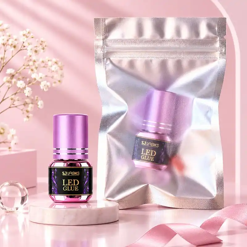
Image title: The pack a customer actually sees
The takeaway
The single sentence worth remembering: matte gold is a substrate decision before it is a foil decision.
Get the black right and the foil looks like metal. Put the same foil on cream and it looks like print. Then keep the foil on the flats, let ink carry the ornament, and pack the box so the caps never touch — because on this product the finish is the product, and a customer judges a 5g bottle entirely by how it looks in her hand.