EN

3D-Printed Lash Bottles: One Body, Three Products (2026)
Three bottles that are the same bottle
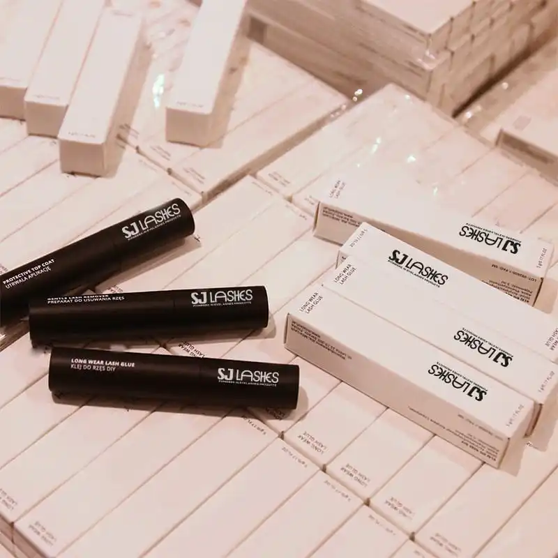
This set is a routine in three parts: a lash glue, a protective top coat — the "raincoat" layer that seals an extension — and a gentle remover to take it all off.
All three are 5g. All three are black cylinders. All three carry the same wordmark, set vertically, in white. And all three have 3D-printed bodies: the same geometry, printed three times, rather than three moulds or three purchased bottles.
That decision buys a lot. One file instead of three tools. A shape you can change without a mould. A colour change that costs a spool of filament rather than a minimum run. A black matte finish that a stock catalogue bottle will not give you at a small quantity.
It also creates a problem that no other format has so sharply, and this article is mostly about that problem — because it is the one that reaches the customer.
Quick answer
| Question | Answer |
|---|---|
| What is printed | The bottle body — geometry and finish, no mould |
| What is not printed | The neck thread, the closure, the liner, the wand |
| Why one body | One print file serves three SKUs; one shape, three labels |
| The new problem | Three identical bottles are hard to tell apart at a mirror |
| The worst confusion | Remover used as glue — or glue used as top coat |
| What separates them | The wand, the cap, and the printed name — in that order of reliability |
| Where printing loses | At scale, when print time costs more than a mould |
| What to verify | Barrier and liquid contact, thread engagement, torque, drop |
What 3D printing actually solves on a bottle
Be precise about the win, because it is narrower than the marketing suggests and much more useful when stated honestly.
No tooling. An injection-moulded bottle needs a mould, and a mould needs a volume to pay for itself. Printing has no mould, so the first unit and the ten-thousandth unit start from the same file. For a brand testing a shape, or running three SKUs at moderate volume, this is the whole argument.
Geometry without penalty. Undercuts, tapered walls, a sculpted shoulder, a body that is not a cylinder because a cylinder was never the point — printing does not care. A mould does, and charges for it.
Colour and finish without minimums. Matte black, deep charcoal, a soft-touch feel, a colour that only exists for one campaign. With moulding you buy a run per colour; with printing you change the spool.
One body, three products. This is the underrated one. Glue, sealer and remover are different liquids with different wands, and they share a body. One print file, one shipping configuration, one carton footprint, three products in the range. That is a genuine economy of scope — and it is exactly the decision that produces the confusion described below.
The seal is not printed, and that is the whole engineering story
Here is the line that separates a good 3D-printed bottle from a leaking one:
You can print the body. You cannot print the seal.
A closure works because of a precisely formed thread, a controlled neck finish, and a liner or plug that compresses at a known torque. That is a system of tolerances developed over decades by closure manufacturers — and it is a purchased part, not something you print. The same is true of the wand: the brush and the wiper are engineered to meter a dose, and they come from a catalogue.
So a printed bottle is really custom geometry wrapped around a standard interface. Which means the questions that decide whether it works are not about the shape at all:
Barrier. Printed parts have layer boundaries, and a printed wall is not automatically a liquid barrier — especially over months, and especially with a solvent-based product. The honest solutions are a printed shell around a standard inner container, a coated or sealed interior, or a material chosen for chemical compatibility. Ask which one you are buying.
Thread engagement and torque. The neck must accept the closure at the specified torque without stripping or relaxing. A printed thread that is slightly oval will leak at the shoulder, not at the thread — which is why leaks are often misdiagnosed.
Wall thickness where the load is. The cap is the widest part and the customer grips it. The printed body must take that grip without deforming at the rim.
Drop behaviour. A printed cylinder has different failure modes from a moulded one: it can split along a layer rather than crack. Test the assembled bottle, filled, dropped, at the temperature it will actually ship at.
The wayfinding problem printing creates
Now the part that reaches the customer, and the part that costs you a review rather than a refund.
Three black cylinders. Same height, same diameter, same cap, same white type set vertically — and vertical type is the hardest orientation to read at speed, because the eye has to rotate the bottle to follow the line.
At a mirror, at night, with one eye shut, holding a bottle you picked up by feel, these three are the same object. And the two confusions this creates are not equal in severity:
Remover used as glue. The customer applies remover to her lash line believing it is adhesive, and the set she has just spent twenty minutes on starts to come apart. Worse, a remover near the eyes is the one product in the range that should never be applied by mistake.
Glue used as top coat. Less dangerous and more common. The sealer is the step people skip, so a bottle that cannot be identified at a glance becomes a bottle that does not get used — and the customer concludes the sealer does nothing, because she never applied it.
Neither of those is a packaging aesthetics problem. Both are the direct consequence of a decision that was commercially excellent: using one body for three products.
The general rule: tooling forces differentiation, because a different bottle means a different mould and nobody pays for that casually. Printing removes the forcing function — so the difference has to be designed in, deliberately, on purpose, and it has to be verifiable by touch.
Where to spend the difference, ranked by reliability
Four channels can separate three identical bottles. They are not equally good.
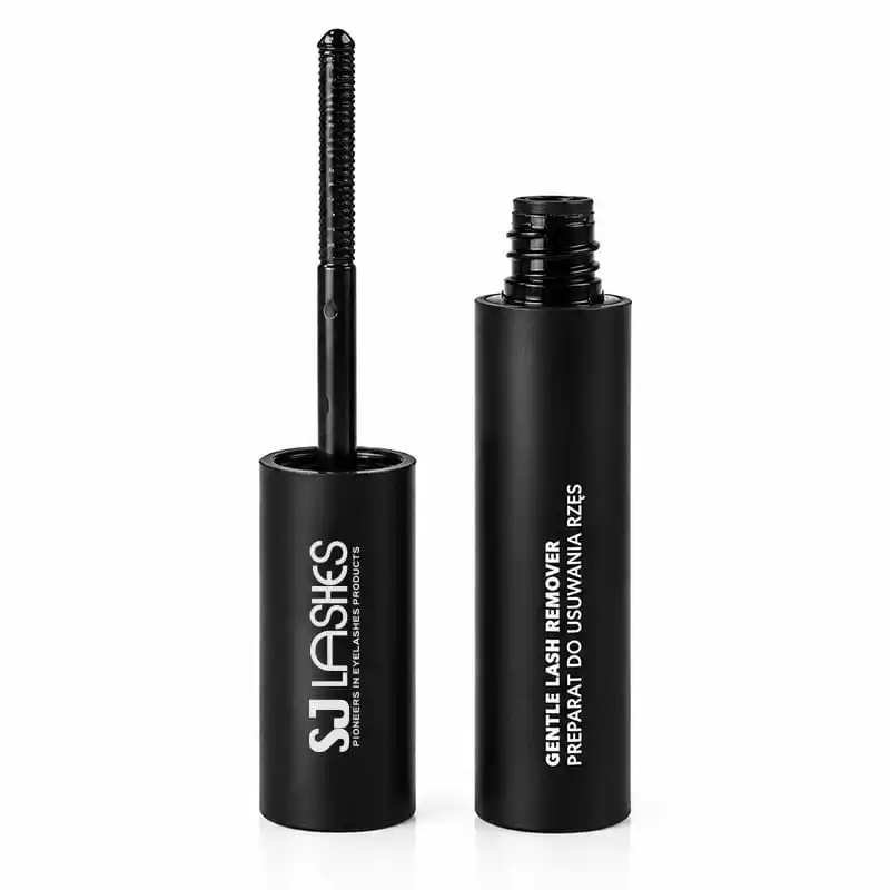
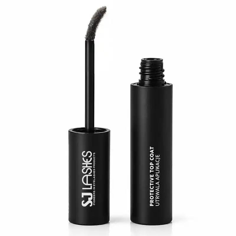
1. The wand — the most reliable, and already done. Look at the three open bottles and the difference is obvious: the glue carries a spiral mascara brush, the remover a long coil, the top coat a tapered spool brush. You cannot mix them up once the cap is off, because the tool is the product.
The catch: the wand only works after the customer has opened the right bottle. It prevents the error from being repeated; it does not prevent the first one.
2. Cap colour — the most reliable before opening. A coloured cap is readable at arm's length, in low light, by touch, without turning the bottle. It is also the cheapest possible change: caps are purchased, so a colour is a stock choice, not a tooling one.
The catch: it breaks the monochrome look this range has built. Which is a real trade — but the monochrome look is what created the problem.
3. A physical change to the printed body — the best use of printing. A raised band, a change in height, a flat that registers under the thumb, a notch at the shoulder. This is exactly what 3D printing does for free: geometry, not ink. Three heights or three thumb-flats cost nothing extra in tooling, and they are readable in the dark.
The catch: the three products no longer line up as a set on a shelf, and a range that does not line up loses some of its display power. Solve it by grouping — the trio in a tray or band — rather than by making them identical again.
4. Vertical type — the least reliable. It is the design language here, and it is also the hardest to read when the bottle is in your hand and turned. Vertical type is excellent for a wordmark and poor for a product name.
The rule that follows: keep the vertical treatment for the brand, and put the product name somewhere the eye can read horizontally — a carton face, a cap top, a wrap label at the base.
The carton is the only surface that can be read
There is a reason the identification problem is survivable in retail and dangerous at home: the carton does the work the bottle cannot.
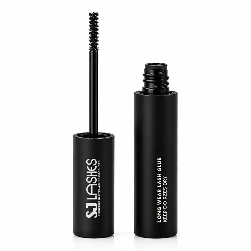
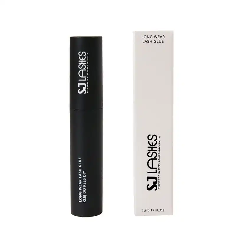
The bottle is black, cylindrical and set in vertical type. The carton is off-white, flat, and carries the product name at the top in horizontal type — the only place in the entire pack where the name can be read without turning anything. In a shop, the customer meets the carton first, and the carton is unambiguous.
That produces three rules, and they are easy to get wrong:
The name outranks the wordmark on the carton face. On the bottles, the brand is the biggest thing — correctly, because there is no room for anything else. On the carton there is room, and a carton where the wordmark dominates and the product name is a small line is a carton that has thrown away its one advantage.
Three cartons in a set must differ at a glance, not on inspection. Cream cartons with the same wordmark and a different three-line name are distinguishable only if you read them. Print the name large, or give each carton a colour band, or number them 1–2–3.
Loose bottles lose the only readable identifier. The moment you sell a refill without its carton, you are back to three black cylinders — which is why a single-unit refill needs a different cap colour or a wrap label at the base. Plan that at artwork stage, not at the first reorder.
The sealer is the step that gets skipped
Worth saying plainly, because it is the commercial reason this trio exists at all.
A three-step routine has an adoption problem in the middle: the glue is obviously necessary, the remover is obviously necessary eventually, and the top coat is optional in the customer's mind — because its benefit is invisible. It does not make lashes longer, thicker or darker. It makes them last, which is a benefit the customer only notices when it is missing.
So the packaging has a teaching job on the one product that will not sell itself. Three things do that work:
- Say what it does, in a result, not an ingredient. "Seals the bond so lashes last longer" beats "protective top coat" — and both fit on a carton.
- Put it in the sequence, visibly. Number the three cartons 1–2–3, or print the routine on the back of all three. A customer who sees a sequence follows a sequence.
- Make it the smallest decision. If the top coat is bundled rather than added, the only question is which one to apply first.
And be honest about what it is: a sealer is not a permanent coating and not a repair. Claiming it makes lashes waterproof, or that it "locks" the bond indefinitely, is the kind of promise that produces a one-star review eight days later.
Equal volumes, unequal consumption
One quiet commercial detail in this set: all three are 5g.
That is tidy on a shelf and wrong in use, because the three products are consumed at very different rates. Glue is used at every application; top coat at every application; remover rarely — most customers remove a set every few weeks, if that.
The consequence: the customer runs out of the glue first, while a third of the remover sits unused. She then either buys a single glue bottle from someone else, or decides the set was poor value.
Two ways to handle it, both legitimate:
- Sell the refill as a single. The trio is the entry point; the repeat purchase is the fast-moving item. Design the carton so a single can ship at retail without looking like a leftover.
- Vary the fill. 5g of glue, 5g of top coat, 3g of remover — matching the actual consumption and making the value story honest. It costs a different fill on the same printed body, which is precisely what a printed body makes easy.
What does not work is pretending the volumes are matched when they are not. A customer who has thrown away half a bottle knows.
When printing stops making sense
An honest cost answer, because most suppliers will not volunteer it.
Printing is priced by time, not by material. A bottle that takes forty minutes to print costs forty minutes of machine, every time, forever. Moulding is priced by tooling plus a very small per-unit cost — expensive once, nearly free after.
So the economics cross over. At low volume, printing wins because there is no tooling to amortise. At high volume, moulding wins because the per-unit cost collapses and print time does not. The crossover point is arithmetic, not opinion:
Print time per unit × your annual volume ÷ your hourly cost, against the mould cost amortised over the same volume.
Two things worth knowing before you run that sum:
- Print time falls as you optimise the file. Wall thickness, infill, orientation and batch nesting all change the number — sometimes by a lot. A supplier who quotes print cost from a finished model may be quoting a model nobody has optimised for printing.
- Finishing is part of the cost. Matte black usually means post-processing: dyeing, coating, or vapour smoothing. That labour does not scale down with volume the way printing does, and it is what actually delivers the look in these photographs.
The practical use of a printed body: it is a bridge. It lets you launch a shape, test three SKUs and change your mind without a mould — and then, when the volume justifies it, mould the shape you have proved. Printing is how you find out what to mould.
Polish labelling, in one paragraph
The cartons in this set carry the product name in English with a Polish line underneath: KLEJ DO RZĘS, UTRWALACZ APLIKACJE, PREPARAT DO USUWANIA RZĘS.
That is the right instinct. EU cosmetic labelling requires the mandatory information in a language easily understood by the consumer in the member state where it is sold — which for Poland means Polish — and a translated product name is the minimum. Keep the descriptive line in Polish, keep the brand in English, and confirm the full mandatory set with your regulatory partner before print.
One caution on the translated names: a literal translation of a technical term reads as machine translation to a native speaker, and a product name that sounds translated undermines a premium pack. Have the Polish line written or checked by a native speaker, not by a translation tool.
Supplier scorecard
What to ask
- Is the printed body a shell around a standard inner, or the container itself?
- What is the barrier between the printed wall and the liquid?
- Which closure and wiper system is used, and is it a stock part?
- What is the specified torque, and how is it verified?
- What is the print time per body, and what is included in that number?
- How is the matte finish achieved, and does it survive alcohol and oil?
- Can I have three bodies that differ physically, not just in print?
- What is the fill volume tolerance per product?
- How are the three products identified on the line during filling?
What to test
- Fill and invert. Fill, close, invert for 24 hours at elevated temperature. Check the shoulder, not just the thread.
- Torque and re-close. Open and close fifty times. A printed neck that relaxes will leak later, not now.
- Drop the assembled bottle at shipping temperature, filled, onto a hard floor. Look for splits along layer lines.
- Blind identification. Hand the three bottles to someone who has not seen them, in dim light, and ask which is the remover. If they hesitate, the pack has failed.
- Finish durability. Rub with alcohol and with oil; check for glossing and for dye transfer onto fingers.
- Carton legibility. Read the Polish line at arm's length. If it needs squinting, so does the customer.
Quote checklist
- All three products, with fill volume per product — not one volume for all three.
- Body: printed shell or container; material; wall thickness; finish process.
- Neck, closure, wiper and wand: which are stock parts, which are custom.
- Barrier or liner specification, and the chemical compatibility behind it.
- Carton: paper, print method, colours, Polish text supplied or checked by whom.
- Identification system across the three: what physically differs.
- Kitting: three products into one set, count check, and how the filler avoids mixing them.
- Packaging configuration for the set, and the single-unit refill.
- Sampling: one filled and labelled set of three, plus one drop-tested unit.
- Print time, finishing time, and lead time per stage.
Compliance and honest claims
- Three products means three label obligations. Glue, sealer and remover are three formulations with three sets of warnings, and the remover is the one where the warning is doing real work. Do not reuse one back panel across all three.
- The remover needs a direction, not just a warning. "Keep away from eyes" is a warning; "apply to the base of the extension, never to the skin" is a direction. The second one prevents the accident.
- Do not claim the top coat makes lashes waterproof, permanent, or sealed indefinitely. A sealer extends wear; it does not change what the product is.
- "Gentle" is a claim. If the pack says gentle, the formulation and any test data have to support it.
- A printed body is not automatically recyclable. Printed polymers and a multi-part closure complicate a single-material claim; check before putting any environmental statement on the carton.
- Nothing on the packaging should promise a fill volume the line cannot hold. Three products at 5g each is a promise made three times.
Why SJ LASHES
A printed bottle is easy to show and hard to ship. The difference between the two is a bought neck, a specified barrier and a closure that holds torque — none of which appear in a render.
- We separate what is printed from what is bought, and tell you which is which before you design a shape that cannot be sealed.
- We test the filled, assembled bottle — invert, torque, drop — rather than testing a shell.
- We design the three SKUs as three SKUs, not one SKU printed three ways, because the customer meets them in the dark.
- We quote the crossover between print and mould, so you know when to stop printing.
- We check the translated label with a native reader, because a machine-translated product name undoes a good pack.
- Low minimums, one filled sample set, fast iteration on the file — so a shape change costs a conversation, not a mould.
👉Talk to us about your liquid set
Frequently asked questions
Can the whole bottle be 3D printed, including the thread? The body, yes. The closure and the sealing interface should be purchased parts — a printed thread will not hold a repeatable seal, and a printed wall is not automatically a liquid barrier.
Is a 3D-printed bottle food- or cosmetic-safe? Only if the material and the barrier are specified for it and the liquid contact has been checked. Ask what sits between the liquid and the printed wall; if nobody can answer, that is the answer.
Why use one body for three products? Because it removes tooling from three SKUs at once and lets you change shape without a mould. The cost is that the three bottles look identical, which then has to be designed around.
How do I stop customers confusing the glue with the remover? In this order: a different wand, a different cap colour, and a physical difference in the printed body. Vertical type alone is the least reliable option.
When should I switch from printing to moulding? When print time per unit stops being cheaper than the amortised mould, at your annual volume. Get the print time in writing, including finishing, before you run the comparison.
Does the top coat actually do anything? It extends wear by sealing the bond. It does not make lashes longer or thicker, and it does not make them permanent — which is exactly why it needs a clear benefit statement on the pack.
Why are all three 5g if they are used at different rates? Convenience at the shelf, not accuracy in use. Varying the fills, or selling the fast-mover as a single refill, is the honest fix.
The takeaway
3D printing is genuinely the right answer for a three-product lash routine at moderate volume: one body, three SKUs, no mould, a shape you can change by editing a file.
But it solves the tooling problem and creates a human one. Three identical bottles are three identical bottles, and in this category the worst version of that confusion involves a remover where glue should be. Design the difference deliberately — a wand, a cap, a thumb-flat — and test it in dim light, on someone who has never seen the set.
And keep the boundaries clear: print the body, buy the seal, and prove the barrier. The rest is design.
👉Related reading: lash glue boxes: the carton is the label · complete lash set packaging