EN
Lash Glue Boxes: The Carton Is the Label (2026 Guide)
The bottle is too small to be the label
A 5g lash adhesive bottle holds about a teaspoon of product. Wrap the brand name around it and you have used most of the printable surface — there is no room for ingredients, warnings, net content, batch number or dates.
So on this product the carton is not decoration around a labelled bottle. The carton is the label, and the bottle is inside it carrying the brand and nothing else.
That one fact reorganises the entire packaging brief. It means the carton has a legal content quota before it has a design, that some of its print is fixed per batch rather than per order, and that the smallest decision — a black carton instead of pink — can put a warning block below the legibility line.
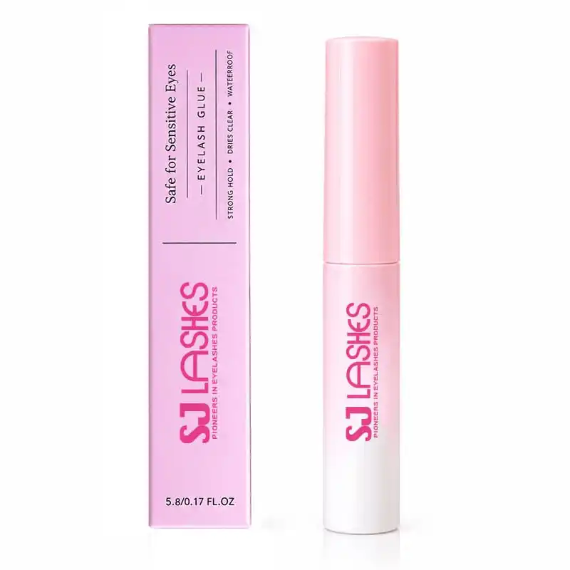
This is the 5g adhesive we pack for an Oman programme, in a slim folding carton, customisable in five box colours. Here is what custom actually covers, and where the line sits.
The Carton Carries Everything the Bottle Cannot
Quick answer
| Question | Answer for this format |
|---|---|
| What it is | 5g / 0.17 fl.oz lash adhesive in a slim folding carton |
| Why the carton matters | It is the label — the bottle has no room for mandatory text |
| What you can customise | Box colour, logo, box size and structure, carton print |
| What is fixed per batch | Production date, expiry date, batch number |
| Box colours shown | Pink, purple, white, black, blue |
| The hidden trap | Dates printed on the carton make it batch-locked, not just brand-locked |
| The other trap | A dark carton needs white ink, and warnings must stay legible |
Everything the carton has to hold
Look at the front panel of this carton and the space is already accounted for: product name, a positioning line, three performance claims, the brand, and the net content. Turn it over and the back carries a warning block, a production date and an expiry date.
That is a full label, fitted to a panel roughly the width of a finger.
Before you design anything, list what has to be on the carton:
- Product identification and the words that tell a customer what this is.
- Net content — 5g / 0.17 fl.oz here, and it must match the fill, not the bottle's nominal size.
- Warnings — the eye-contact and irritation text on this carton is not optional copy; it is what makes the product sellable.
- Production and expiry dates, or a batch code plus a period-after-opening mark, depending on market.
- Responsible party — who stands behind the product in that market.
- Ingredients where the market requires them, which on a 5g product usually means somewhere other than the bottle.
The design consequence: the artwork is not a layout with text poured into it. It is a budget — and the brand has to be designed around the mandatory block, not the other way round. Brands that design the pretty panel first and discover the warning text afterwards end up shrinking the warnings, which is exactly the wrong thing to shrink.
The dates are printed on the carton — which makes it batch-locked
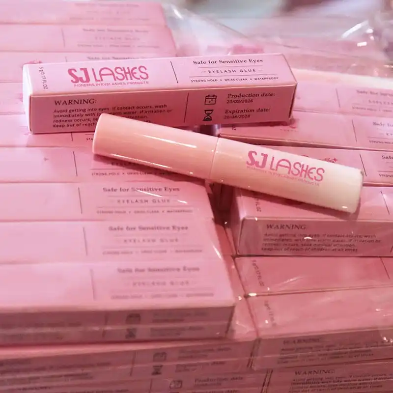
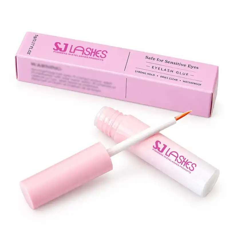
Here is the part most brands only discover at their second order. On the bulk cartons in these photographs the back panel carries a production date, an expiry date and a warning block — printed on the carton itself, not stamped on the bottle.
Which means the carton is not only brand-specific. It is batch-specific. Ten thousand cartons printed in March cannot be used for product filled in September, because September's product has different dates on a panel that was printed in March.
There are only two ways to live with this, and you should choose deliberately:
1. Print the carton per batch. Dates are in the artwork, the carton is ordered with the fill, and every order is a new print run. Simplest to control, hardest on minimum quantity — you cannot amortise a print run across a year of fills.
2. Print a general carton, then overprint or stamp the dates. The carton carries everything else, and the variable data is applied at filling: inkjet overprint, hot stamp, or a printed label. Higher set-up per batch, much better print economics on volume, and the carton can be ordered in one large run.
The right answer depends on your fill pattern, not on taste. If you fill in small batches through the year, overprinting wins. If you fill once in a large run, printing dates into the artwork wins.
One consequence people miss: if you overprint, the panel needs a reserved blank area for it — sized for the stamp, positioned where it stays legible, and specified before the artwork is finalised. A carton designed edge-to-edge with print has nowhere to put a date, and that is discovered at the filling line.
Dates on the Panel — the Carton Belongs to a Batch
What the dates mean commercially
The cartons in these photographs read production 20/08/2024 and expiry 20/08/2028 — a four-year window from fill, printed on the pack.
A long shelf life is good news for a distributor and a planning problem for a brand, because it sets an inventory clock that the packaging has made visible. Two things follow.
The carton you print today may outlive your artwork. If a rebrand lands in year two, you are either destroying cartons or shipping old-brand boxes with fresh dates on them. That is an argument for the overprint method: keep the printed carton generic, and the batch data is the only thing that changes.
Short-dated stock has nowhere to hide. With dates on the panel, a customer or a marketplace can read freshness directly. That is a fair thing to offer — and it means your filling plan has to be honest about how long stock will sit.
The tip decides the bottle, the bottle decides the carton
Same chain of consequences as a tray and a tool, and just as easy to get backwards.
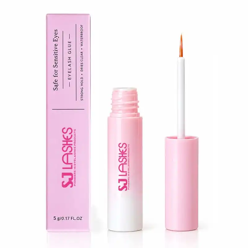
This adhesive has a fine tapered brush rather than a wand, because a lash adhesive is applied as a thin line at the root, not painted on. A fine brush needs a narrow neck and a slim cap — and a slim cap on a small bottle gives you a bottle that is long and thin rather than short and fat.
That shape is what the carton has to hold, and it creates three specific problems:
Length tolerance. A long thin bottle in a long thin carton has more room to slide than a squat one. Too loose and the bottle travels end to end and the cap takes the impact; too tight and the carton bulges at the seam.
Cap clearance. The cap is the widest part of this pack and the part a customer grips. If the carton is sized on the bottle body, the cap will either bind going in or leave a bulge on one panel.
No protection for the tip. The brush is inside the bottle when closed, so the carton does not need to protect the tip directly — but it does need to stop the bottle rotating and loosening. A cap that backs off in transit is the failure that leaks.
The correct order of work: specify the bottle and the cap closure first, then the carton's inner dimensions, then the print area. The reverse order — design the carton, then find a bottle that fits — is how brands end up with a beautiful box and a bottle that rattles in it.
A Fine Brush Means a Slim Bottle, and a Slim Carton
Custom means colour, logo, size — not the label
The customisation offer on this pack is real, and it is worth being precise about what it covers so you can brief it properly.
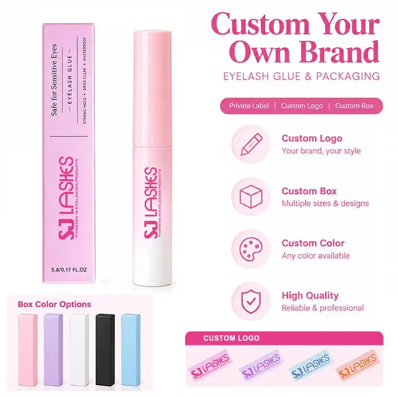
What changes: carton colour (pink, purple, white, black, blue and any colour you specify), the logo, the carton's size and construction, and the printed design on every panel.
What does not change with a colour selection: the net content, the warning text, the dates, and the claims. Those are governed by what is inside and where it is sold, not by the brand's palette.
And then there is the dark carton problem. A black carton looks expensive and is the hardest to make compliant, because paper is not white underneath the ink — a dark carton needs a white flood or white ink for any text that has to read, and small warning type reversed out of black is the first thing to become illegible.
If you want black, the honest design answer is: keep the mandatory block on a white or light panel, or set it in a light ink at a size you would never use on a pale carton. Do not assume the small type will be fine — check it on a physical proof at arm's length, in dim light, the way a customer reads a warning.
Five Colours — and One of Them Needs White Ink
Three claims that are printed on the carton and inherited by every market
The front panel of this carton makes three promises: strong hold, dries clear, waterproof — and a positioning statement, safe for sensitive eyes.
Each of those is a performance claim printed on a pack. They are the right things to say, and they carry a cost you should know about before your artwork is signed: once printed, they are made in every market the carton is sold in, and they are the sentences a regulator or a dissatisfied customer will quote back at you.
Substantiation. "Strong hold" and "waterproof" are testable. If you make them, be able to describe the test — how many hours, what conditions, what retention. A supplier's marketing sheet is not a test report.
"Safe for sensitive eyes" is the strongest of the four and the easiest to regret. It reads as a safety assurance to a consumer. If you keep it, keep it because you can support it for your formulation and because you also tell the customer to patch test — the two go together. A pack that promises safety and omits the patch-test instruction is asking for the one complaint it cannot answer.
"Dries clear" is a formulation claim, not a design choice. It depends on the fill and on the application thickness; it is not something artwork can guarantee. If the fill changes, the claim has to be rechecked.
The practical rule: treat anything in quotation marks on the front panel as a legal statement, and decide it with the same care as the warning block. It costs nothing to change a claim before printing and a great deal to change it after ten thousand cartons exist.
What to check before you approve the artwork
Six things, in this order — each one is cheap now and expensive later.
- Does the carton's inner length actually match the closed bottle, including the cap? Ask for the dimension, not for reassurance.
- Is there a reserved area for overprinted dates, if you are not printing them per batch?
- Does the net content match the fill? A carton that says 5g on a 4.6g fill is a labelling error that follows the product into every market.
- Is the warning block legible in the finish you chose — especially reversed out of a dark carton?
- Does the responsible party appear, with an address a customer could actually write to?
- Do the dates on the digital proof make sense — production before expiry, and a window you can actually ship within?
The back panel is the one that gets read twice
Front panels are read once, at the moment of choosing. Back panels are read twice: once in the shop by the customer checking what she is buying, and once at home, at the mirror, usually with one eye closed.
That second reading is the one packaging people forget. A warning block set in 6pt grey on pink is legible on a screen at 200% and unreadable on a carton held at arm's length by someone whose other eye is busy.
Three rules for the back of a lash glue carton:
- Set the warning and the dates in a size you would use for a headline, not for legal small print. On a panel this narrow, that usually means giving the back over to compliance entirely and keeping the brand on the front and one side.
- Group dates, batch and warnings together, so a customer or a stock auditor reads them in one glance rather than hunting along four panels.
- Do not foil, emboss or laminate over them. Any finish that reduces contrast on the back panel is a finish that makes the product harder to use safely.
The photograph below shows the arrangement that works: brand on the front, and a back panel carrying the warning text and the two date lines as a single block, with the product name repeated above it so the panel is self-explanatory even separated from the front.
One Block for Warnings and Dates
Two surfaces, one brand
There is a quiet design failure in this category that nobody complains about and everybody notices: the bottle and the carton not looking like the same product.
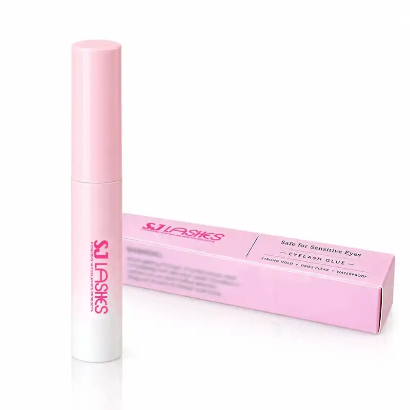
The bottle carries the brand; the carton carries the brand plus the label. If the logo sits at a different height, in a different pink, at a different weight, the pair reads as a component and a box rather than as one product. On a shelf where the bottle is displayed beside its carton, that mismatch is the whole first impression.
Three things to align, and they cost nothing:
- One logo lockup. Same proportions, same colour value, used at both sizes. A logo that only works at carton scale will look heavy on a 5g bottle.
- One pink. A gradient bottle against a flat carton in a slightly different pink is the most common version of this error, and the most visible.
- One alignment rule. If the carton sets the brand at the lower third, the bottle should not set it at the middle. Pick a rule and apply it to both.
Bottle and Carton Should Read as One Object
Supplier scorecard
What to ask
- What is the carton's inner length and diameter, and which bottle does it fit?
- Is the carton sized on the bottle body or on the cap?
- How are dates applied — printed in artwork, inkjet overprinted, or stamped?
- If overprinted, what area is reserved, and how large is the stamp?
- What is the board weight, and does the carton crease without cracking on a dark colour?
- On a black carton, does the warning text use white ink or a white flood?
- What is the fill volume tolerance, and what net content does it support?
- Can I see the same carton in two colours before committing?
- What is the minimum for a colour change, and does it differ from a print change?
What to test on a sample
- Rattle test. Shake the sealed carton. The bottle should not travel end to end.
- Cap test. After the rattle test, check that the cap is still tight. A cap that has backed off will leak.
- Seam test. Press the carton along its seams. Bulging means it is sized too tight; a visible gap means the bottle is loose.
- Legibility test. Hold the back panel at arm's length in ordinary room light and read the warnings and the dates. If you squint, so will the customer.
- Date test. Confirm the overprint or stamp registers inside its reserved area on ten consecutive units, not just the first.
- Dark-colour test. On black or a deep colour, check the warning block for ink fill, pin-holing and contrast.
- Drop test. Drop a packed carton from waist height onto a hard floor, then check the bottle for damage and the carton for a split crease.
Quote checklist
- Fill volume, bottle and cap specification, and applicator type.
- Carton dimensions, board grade and colour.
- Carton structure and how it opens.
- Print: number of colours, plus whether white ink is needed.
- Mandatory content list, and which panels carry it.
- Date method: in-artwork, overprinted or stamped — with reserved area if applicable.
- Claims to be printed on the front panel.
- Whether the bottle and carton branding are being matched from one artwork file.
- Carton and pallet configuration.
- Sampling quantity and lead time, including any overprint set-up per batch.
👉Request a sample of our lash glue cartons
Compliance and honest claims
- The carton is the label, so treat it as one. Product name, net content, warnings, dates or batch identification, and the responsible party all have to be present and legible. Requirements differ by market — confirm the current rules for each destination with your regulatory partner, because this is the part of the artwork that cannot be fixed after printing.
- Net content must match the fill. A 5g declaration on a short fill is a labelling failure that ships to every market at once.
- "Safe for sensitive eyes" needs support, and it needs company. If you make the claim, publish a patch-test instruction with it. The claim protects the customer only if she is told how to check it.
- Performance claims should be testable. Strong hold and waterproof are checkable statements. Keep the test description on file; "our supplier says so" is not evidence.
- Ingredient labelling is market-specific. In the EU, cosmetic labelling rules require an ingredient list, a responsible person and a batch identification, with the language of the member state — on a 5g product that means the carton or an insert. Check whether your product's classification puts it under cosmetic rules in the markets you sell to.
- Do not let the carton outlive its truth. If a formulation or a claim changes, the printed carton carries the old version until the run is exhausted. That is an argument for overprinted variable data and for keeping the fixed claims few.
Why SJ LASHES
A glue carton is a compliance document with a pretty front. Both halves have to be right, and the second half is usually where the delays come from.
- We size the carton to the closed bottle, cap included — not to the body with the cap assumed.
- We plan the date method with you, because printed-in dates and overprinted dates lead to different minimums, different artwork and a different filling line.
- We test legibility on the physical proof, especially on dark cartons where the warning block is the first thing to fail.
- We match bottle and carton from one artwork file, so the logo sits the same way on both.
- Low minimums and fast sampling. Colour changes are cheap; a carton that rattles or a warning that cannot be read is not something you want to discover at scale.
👉Talk to us about your lash glue packaging · See packaging options
Frequently asked questions
Why does a 5g lash glue need a box at all? Because the bottle is too small to carry the label. Net content, warnings, dates and the responsible party have to live somewhere, and on a 5g product that somewhere is the carton.
What can I customise on a lash glue carton? Box colour, logo, carton size and structure, and the print across all panels. In this range the standard colours are pink, purple, white, black and blue, plus any colour you specify.
Why can't I reuse cartons from a previous batch? Because the production and expiry dates are printed on the panel. A carton printed for one batch carries that batch's dates, so it cannot be used for a later fill.
Should the dates be printed in the artwork or overprinted? Overprint if you fill in small batches through the year — it lets you buy cartons in one large run. Print them in the artwork if you fill once in a large batch. Either way, decide before the artwork is finalised.
Is a black carton a problem? It needs white ink or a white flood for anything that has to read, and small warning text reversed out of black is the first thing to become illegible. Keep the mandatory block on a light panel, or test it on a physical proof.
Can the carton be too tight? Yes — a carton sized on the bottle body rather than the cap will bind or bulge at the seam. Size it on the largest dimension with the cap on.
How do I stop the bottle loosening in transit? By sizing the carton so the bottle cannot travel end to end. A bottle that can slide is a bottle whose cap can back off, and a backed-off cap leaks.
What should the back panel carry? The warning block, the dates or batch identification, and the product name repeated, set large enough to read at arm's length.
The takeaway
On a lash adhesive, the carton is not packaging around a label — it is the label. That makes it the one part of the pack where customisation meets regulation: colour and logo are yours, net content, warnings and dates are the product's.
Get the order right and the pack is straightforward: bottle and cap first, carton dimensions second, mandatory block third, design last. Reverse it, and you will discover — at the filling line — that a carton printed edge to edge has nowhere to put a date.
👉Related reading: custom segment lash cards · hot foil on lash boxes