EN

DIY Lash Kit Packaging: Building the Complete Branded Family
Most packaging briefs start with the box. That is the wrong place to start.
A DIY lash kit is not one product. It is a sequence of small decisions a customer makes in a fixed order: she opens the box, works out what each piece is, reads how to use it, applies it, and decides whether to buy it again. She meets five or six different objects along the way, and the set is judged on the weakest one, not the best one.
That is why we photograph our kits as a family rather than as a hero shot. A beautiful box next to a confusing instruction card is a confusing product with a beautiful box.
This guide breaks down the complete family — a seven-row pre-glued segment box, a numbered cluster box, a bond/sealant/remover trio box, a five-step instruction card and a thank-you card — and the design logic that makes the sequence work rather than just the boxes.
👉Request a free sample of the complete family
Quick answer
Design the sequence, not the boxes.
The six touchpoints a DIY lash customer meets, in order:
- The outer lash box — tells her what she bought.
- The inner tray — tells her which cluster to pick up.
- The liquid trio box — tells her what each of the three liquids is for.
- The instruction card — tells her how, in order.
- The thank-you card — tells her who made it, and quietly invites her back.
- The removal process — decides whether she buys again.
Skip any one and the others carry the weight. Most DIY lash brands over-invest in step 1 and under-invest in steps 4 and 6, which are the two steps that generate complaints.
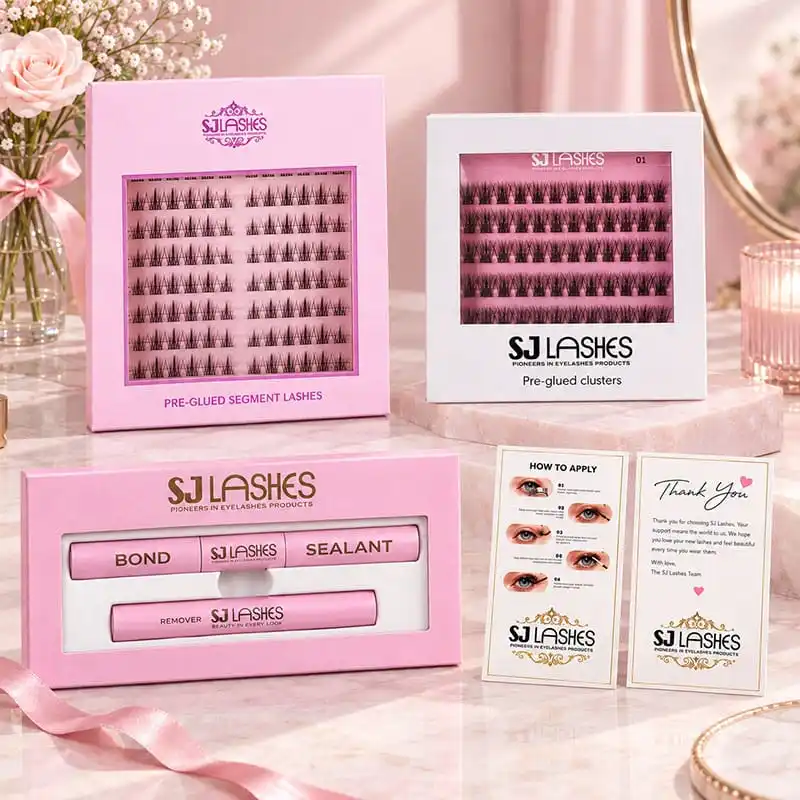
Image title: The Family Portrait — Every Touchpoint in One Visual System
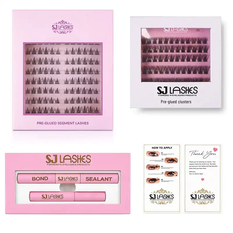
Image title: Photograph the Lineup, Not Just the Hero
Touchpoint 1 — The segment box: what she bought
The pink segment box carries seven rows of pre-glued clusters behind a framed window, with an orchid foil flourish above and the product name printed plainly below.
Two design decisions are doing the heavy lifting:
The window is framed. A thin coloured frame around the aperture reads as a deliberate aperture rather than a hole, and it costs nothing beyond a second print line.
The rows are split by eye. Each row is divided into a left half and a right half with printed labels. This removes the "which one is which" hesitation on first use — and that hesitation, repeated across seven rows, is what makes a beginner give up. It also means the pack needs no leaflet to explain its own layout.
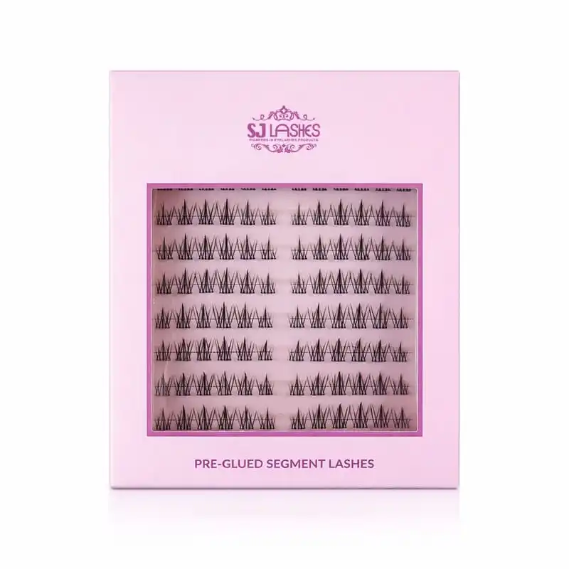
Image title: Seven Rows, Split by Eye — a Pack That Explains Its Own Layout
Touchpoint 2 — The numbered cluster box: how the range grows
The white cluster box holds five rows behind a window, with the product name and the brand line printed in black below the aperture. Small at the top right sits a number: 01.
That number is the most commercially interesting element in the whole family, and it is easy to miss.
A number converts a product into a series. It tells the customer that 02 and 03 exist, that they belong together, and that she has not seen the whole range yet. It signals deliberate merchandising rather than a single SKU that happens to exist. And it makes the range legible at a glance on a shelf or in a grid of listing images.
The engineering detail that makes it work is the contrast against the segment box: the pink box is a different colour, a different format and a different row count, and both still read as one brand. Format distinguishes the products; colour and typography hold the family together.
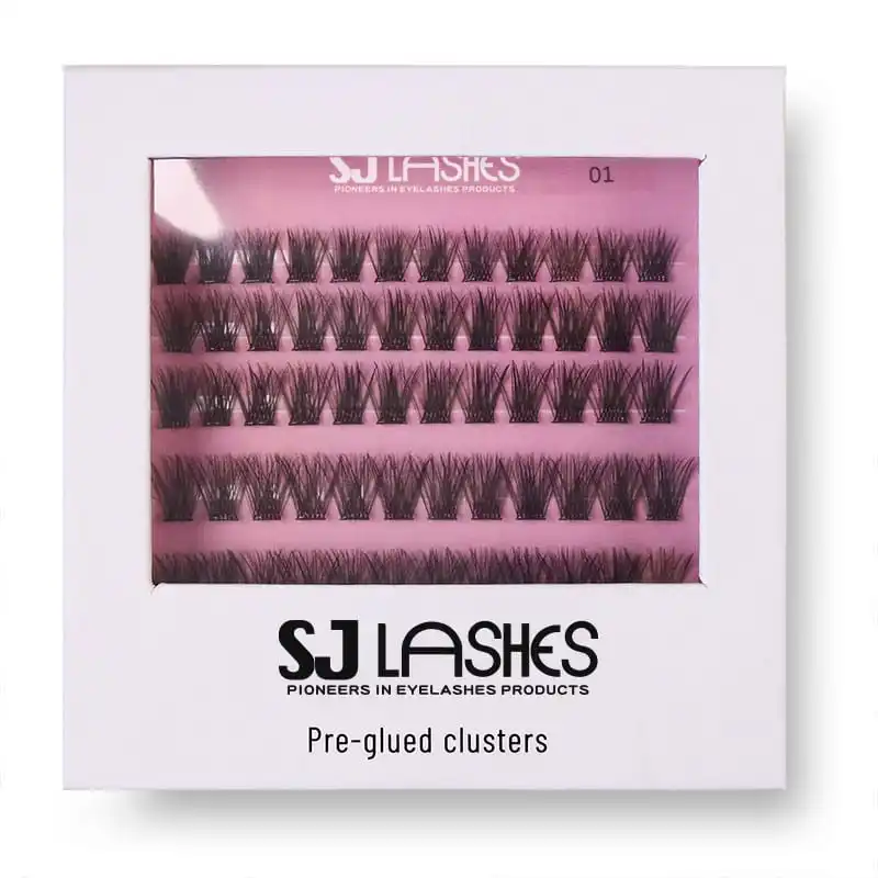
Image title: The Number Converts a Product Into a Range
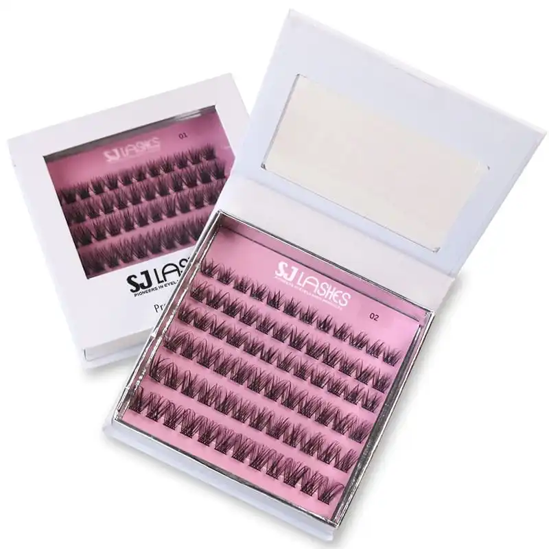
Image title: Same Box, Two References — 01 and 02 Side by Side
Touchpoint 3 — The liquid trio box: three liquids, one window
Bond, sealant and remover ship together in a single horizontal window box. The window shows all three tubes at once, each labelled in the same type.
This is a system box, not a product box, and it earns its place for one reason: bond, sealant and remover are the three components customers confuse most often. Sold in separate boxes or unlabelled, they get mixed up — and a customer who seals when she meant to bond gets a bad result and blames the product.
Showing all three behind one window solves identification at the point of purchase rather than at the point of use. She can see there are three, and she can see which is which, before she spends anything.
The order matters and the box should imply it: bond goes on first and holds the cluster, sealant goes on afterwards and locks the base, remover is for the day she takes it off. Naming them in that order on the panel, left to right, costs nothing and prevents a predictable mistake.
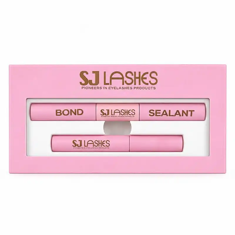
Image title: Three Tubes, One Window — Solve the Confusion Before Purchase
Touchpoint 4 — The instruction card: where most brands lose the customer
The instruction card is the cheapest item in the family and the one that decides whether the set works.
Ours runs five steps with a photograph per step. The steps are worth reading closely, because the value is in the specific words rather than the design:
- Curl your natural lashes with an eyelash curler for better application.
- Apply bond along the base of your natural lashes. Wait 20-30 seconds and apply.
- Use the tweezers to place each lash cluster underneath your natural lashes.
- Brush seal onto the lash base and let it dry completely.
- Press to fuse your natural lashes and clusters together using the tweezers.
Two of those five steps contain the whole difference between a good result and a bad one, and both are the kind of detail brands routinely leave out.
Step 3 — the word "underneath". Placing clusters underneath the natural lashes rather than on top is what makes the result look like extensions rather than like strips sitting on the lid. It is also the single most common mistake a beginner makes, and the reason a first attempt looks wrong. A card that says "apply the clusters" without the word underneath has not done its job.
Step 2 — "wait 20-30 seconds". Bond needs time to become tacky. Applied immediately, the cluster slides; applied too late, it does not grip. Twenty to thirty seconds is not a detail, it is the difference between a cluster that stays all day and one that lifts by lunchtime.
There is also a step missing, and this is the observation we would most want a brand to act on: the card covers application in five steps and says nothing about removal. Removal is the step that decides whether she buys the set again — a customer who cannot comfortably take the lashes off does not reorder, however much she liked wearing them. Adding a removal step, even two lines at the bottom, is the cheapest route to repeat purchase available to you.
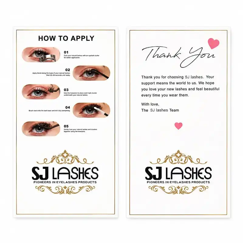
Image title: Five Steps — and the Two Words That Decide Whether It Works
Touchpoint 5 — The thank-you card: the cheapest touchpoint that earns the most
The thank-you card says little: thanks for choosing us, we hope you love your lashes, with love, the team. It carries a heart and the brand flourish, and it costs less than anything else in the kit.
It is also the object most likely to end up in a photograph. Customers do not post the liquid box; they post the thing that felt personal. In a category where trust is the main purchase barrier, a card that names the team and thanks the customer does more brand work than another line of product copy.
For a brand building a line, this is the highest-return item per unit spent in the entire family — and it is the first thing cut when budgets tighten, which is exactly backwards.
The sequence test: how to check a kit before you print
This is the method, not a list of opinions. Lay the family out and walk the sequence the customer walks.
1. The open test. Open the box cold, knowing nothing. Can you tell what you are looking at within five seconds?
2. The identify test. Point at each item and name it out loud. Any object you hesitate on needs a label.
3. The order test. Can you tell which liquid goes on first? If the box does not make the order obvious, a customer will guess — and guess wrong.
4. The step-3 test. Read only the instruction card and try to apply a cluster. If you place it on top of the natural lashes, the card failed at step 3.
5. The removal test. Now try to take it off using only what is in the kit and printed on the card. If you cannot, the kit is not reorderable.
6. The reorder test. Cover the box and ask what you would search for to buy it again. If the answer is vague, your naming is vague.
7. The photo test. Photograph the family as a lineup. If it does not look deliberately curated, the shared design system is too loose.
Any kit that passes six and fails one has found the touchpoint to fix. That is the value of testing the sequence rather than the boxes.
What must match, and what must differ
Hold these constant across the family
- The logo flourish, in the same foil and the same size on every piece.
- The brand line, spelled and spaced identically everywhere.
- One typography scale, so product names sit on the same baseline grid.
- One finishing set — the same lamination family throughout.
- One specification file shared across every component.
Let these differ per product
- Colour, where it distinguishes a format — pink for the segment box, white for the cluster box.
- Format — vertical, horizontal, or slim, according to what is inside.
- Row count and window size.
- The number, where the product belongs to a numbered series.
- The content of the cards, sized to the learning curve.
The rule underneath: let format and colour distinguish, and let logo and type unite. That is what produces a shelf where the pieces are clearly different products and unmistakably one brand.
Customization options
- Box formats — vertical segment box, numbered cluster box, horizontal liquid trio box.
- Window shapes — rectangle, heart or teardrop, with PVC film from 10 mil to 14 mil, or a paper aperture where the construction allows.
- Structure — folding cartons on coated art paper from 250gsm to 350gsm, or rigid boxes from 1.5mm to 2.0mm with magnetic closure or lift-off lid.
- Print finishing — CMYK or Pantone spot, hot foil stamping in gold, silver or rose gold, spot UV, debossing and embossing, gloss or matte lamination.
- Tray design — row count, left/right split, cluster pockets and liquid channels.
- Numbering — series numbers and their placement on the front panel.
- Card content — instruction steps, numbering, photography, and the thank-you message.
- Liquid labelling — direct logo printing on tubes, or adhesive labels carrying full brand and ingredient information.
- Logo placement — applied consistently across board, tube and card.
Supplier scorecard and sampling
What to ask
- Can you produce the boxes, the liquids and the cards from one specification file so the logo, foil and type stay identical?
- Can you print a series number cleanly at the size we need?
- Can you supply instruction cards printed and packed with the kit rather than as a separate shipment?
- Can the liquid tubes carry direct logo printing, and what is the minimum type size?
- Can you print full ingredient and warning information on a card or label for our market?
- Which components can share tooling, and which genuinely need their own?
- What documentation accompanies the liquids — safety data, ingredient lists, batch coding?
What to check on the sample
- Lineup test. All pieces side by side under one light. Anything that reads as a different brand goes back.
- Sequence test. Walk the seven checks above, in order, as a customer would.
- Type test. Read the instruction card at arm's length in ordinary indoor light. If step 3 is hard to read, it will not be followed.
- Liquid legibility. Confirm bond, sealant and remover cannot be confused — including by someone who has never used a lash kit.
- Card durability. Handle the cards the way a customer will, with damp fingers. Uncoated cards mark quickly.
- Packing test. Ship a kit and confirm the tubes have not moved against the cards or the lash tray.
Channel notes
Kits as the core SKU. A complete family lets you sell a bundle at a price point that a lash box alone cannot reach, and the cards make it feel like a system rather than a bundle of leftovers.
Selling components separately. The numbered cluster boxes and the liquid trio should each be able to stand alone. That is what the numbering and the trio window are for.
Marketplace and social. The thank-you card and the instruction card are the two most photographed items in the kit. Design them as content, not as paperwork.
Salon and professional resale. Professionals reorder liquids far more often than lashes. Make the liquid trio easy to buy on its own and the line earns between lash sales.
Subscriptions. Bond, sealant and remover are consumables on a predictable cycle. A trio box is the natural subscription unit.
OEM workflow
- Map the sequence — list every touchpoint the customer meets, in order, before designing anything.
- Assign each touchpoint a job — identify, instruct, reassure or reorder. One job each.
- Fix the shared system — logo flourish, brand line, type scale, finishing, specification file.
- Write the instruction card first, not last. It is the touchpoint most likely to fail.
- Add the removal step. If it is not on the card, the kit is not reorderable.
- Design the numbering and the trio window so the range is legible before purchase.
- Physical sample and sequence test — the seven checks.
- Produce and archive — one specification file per component, with card content versioned.
Quote request checklist
- Target market and channel.
- Which touchpoints are in the family, and which sell separately.
- Box formats, row counts and window requirements.
- Liquid components and whether they ship as a trio.
- Instruction card — steps, photography, language, size.
- Thank-you card — message and any reorder or care information.
- Series numbering scheme.
- Brand colour references, as Pantone spot values.
- Foil colour and logo placement rules for the family.
- Board weights, lamination and structure per component.
- Label content requirements for your market.
- Sample quantity, first order quantity, and delivery window.
👉Request a free sample of the complete family
Compliance and honest claims
- The liquids carry the heaviest obligations. Bond, sealant and remover are cosmetic products in most markets, with ingredient declaration, batch coding and market-specific language requirements. Budget more compliance time for the tubes than for the boxes.
- State the order and the function plainly. Telling a customer which product is the adhesive and which is the top coat is both a usability and a compliance benefit.
- Do not publish wear durations unless your finished product documentation supports them.
- Include patch-test and stop-use guidance on the instruction card or the label, and keep the wording consistent across every component.
- Avoid absolute claims — "lasts all day", "suitable for all eyes" and similar wording needs substantiation.
- Keep ingredient information accurate and current. If a formulation changes, the card and label change with it.
- Treat cards as regulated labelling, not as decoration. If they carry ingredient or warning information, they are part of the product labelling.
Requirements differ between markets. Confirm the final content for your target market with your compliance adviser before the print run.
Why SJ LASHES
- Boxes, liquids and cards from one factory — which is what makes one specification file possible and keeps the logo and type identical across the family.
- Liquid packaging expertise alongside lash packaging, including direct logo printing on tubes and label design for full ingredient information.
- Instruction and thank-you card production, printed and packed with the kit rather than sourced separately.
- Row and tray engineering covering both formats — a seven-row split tray and a five-row numbered card.
- Colour and foil control so the flourish matches across board, tube and card, and holds on reorder.
- Low MOQ with fast sampling, so you can test the whole family before committing to the line.
See our all-in-one packaging, cluster lash kit boxes, cluster lash glue boxes and lash liquid packaging ranges.
FAQ
What should a complete DIY lash kit include?
At minimum: the lash product in a box that identifies it, an adhesive system, and an instruction card. A strong kit adds a sealant and a remover, numbers its products if it is part of a series, and includes a thank-you card. Every piece should have one clear job.
Why does the instruction card matter more than the box?
Because the box sells the product once and the card decides whether the product works. If a customer cannot work out which way the clusters go, she does not blame her technique — she blames the lashes, and she does not reorder.
What is the most important instruction to include?
Telling the customer to place each cluster underneath the natural lashes rather than on top of them. That single word is the difference between a result that looks like extensions and one that looks like a strip sitting on the lid, and it is the mistake beginners make most often.
Should my kit explain how to remove the lashes?
Yes, and this is the step most kits leave out. Removal decides whether the customer buys again — someone who cannot comfortably take the lashes off will not reorder, no matter how much she liked wearing them.
Why put a number on the lash box?
A number turns a product into a series. It tells the customer that other references exist, that they belong together, and that she has not seen everything yet. It also makes a range legible at a glance on a shelf or in a grid of listing images.
Why do bond, sealant and remover ship in one box?
Because they are the three components customers confuse most often. Showing all three behind one window solves identification at the point of purchase rather than at the point of use, and naming them in the order they are used prevents a predictable mistake.
Can the two lash formats share one box design?
They can share a design system, but not a tray. The segment box and the cluster box hold different row counts and different cluster types, so each needs its own tray. Sharing a tray means one product gets a tray that does not fit it, and that is the product that generates complaints.
What is the minimum order for a complete custom lash kit family?
It depends on how many components share tooling and how many need their own boxes, trays and labels. Share your touchpoint list and target quantities and we will confirm what is achievable for a first run.
Final thought
A lash kit is not a box with things in it. It is a sequence, and the sequence has a weakest link.
Design the steps in the order your customer meets them — what she bought, which cluster to pick, which liquid is which, how to apply it, who made it, and how to take it off. Get the last one right and the first one keeps earning.
👉Request a free sample and quote from SJ LASHES
For more packaging development, factory footage and application education, follow SJ LASHES on Instagram and read the SJ LASHES blog.