EN
Lash Growth Serum Pens: Judge the Finish, Not the Render
This is a pen, not a bottle with a label
A 5ml serum could ship in a dropper bottle. It ships as a pen, and that single decision sets every process question that follows.
A pen is held like a pen, capped like a pen, and read at 30cm. It has a tapered nose, a long cap that doubles as the handle, a seam near the widest point, and one small flat-ish area where the type can live.
On this pack that area is a polished oval panel on an otherwise matte gold body. Everything else in the design is arranged around protecting it and making it readable — and that is the whole story.
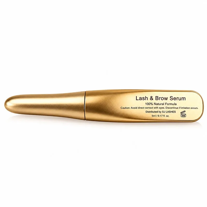
Image title: One body, two finishes, one place to read
The short answer
| Question | Answer for this 5ml gold pen |
|---|---|
| Why matte on the body? | Hands are unforgiving; matte hides prints and scuffs |
| Why polished on the panel? | Black type needs a specular surface to read against |
| Can one surface do both? | No — that is the trade the design is built on |
| What is the hardest process step? | Holding two finishes and matching them across the cap joint |
| Does "3D printed" mean it comes out gold? | No. The finish is a post-process, and it is most of the work |
| What must the pouch do? | Block light, not just look expensive |
Give the type its own surface
Matte gold and polished gold are not two shades of one colour. They are two different optical behaviours, and only one of them can hold small black type.
Matte gold scatters. Light leaves the surface in every direction, so the surface sends back a soft, even tone almost independent of where you stand. That is why it survives handling: a fingerprint adds almost nothing to a surface that is already scattering. It is also why type on it goes soft. The letters sit in a field of low-contrast, slightly granular reflected light, and black ink on a mid-tone scatter is the worst contrast pairing in packaging.
Polished gold reflects. Light leaves at the angle it arrived, so the surface takes on whatever is around it — a window, a lamp, the photographer's white card. In a real room that makes it read dark-to-mid with a bright streak, which is exactly the tonal range black type needs.
So the panel is not decoration. It is a contrast device. Take it away and the same black letters on the matte body would read as a smudge at arm's length.
Then look at the shape of the panel. It is not a rectangle. It is a soft oval that follows the taper of the barrel, with a crisp edge and its own rim, and the same polished treatment reappears as a bezel around the tail end. That repetition is what makes the object look designed rather than labelled: the polish is a material story, and the panel is where that material is asked to do work.
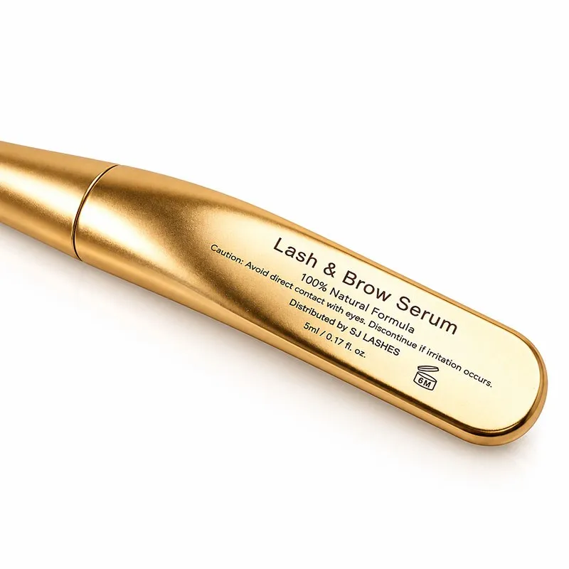
Image title: A polished window, recessed into a matte body
The panel is sunk, and that is the durability trick
Look at the edge. The panel sits at or slightly below the surrounding body — it is a well, not a bump.
That matters more than it looks. A polished surface in a bag is the first thing to haze, because polish shows abrasion as a change in specular behaviour rather than as a scratch. Sinking the panel puts the body's own shoulder between the polish and everything it might rub against.
Two rules follow, and they are worth putting in writing with a supplier:
- Recessed panel: good. The polished edge is protected by the matte wall in front of it.
- Proud panel: a design debt. It will be the first surface to dull, and it will dull in a band, not a spot, because the abrasion is distributed.
The polished bezel at the tail is the exception that proves the point — it is exposed, and on a used pen it is where you will first see the finish age.
Two finishes on one body: where it actually fails
Producing a matte body is easy. Producing a body with a matte field and a polished window in one piece is where the cost and the defects live.
There are three ways to get there, and each fails differently:
Mask and coat. The body is finished matte, the panel is masked, the mask is pulled, and the window is polished or receives a clear gloss. Cheapest, and the boundary is a hand operation — so the boundary is a per-unit labour cost and a per-unit wobble. On a curved shell the mask edge is never perfectly on the curve, and under raking light you can see the tape line as a faint step.
Two tool faces. The mould, or the printed shell, carries the polish in the geometry: one face is smooth, the rest is textured. This is the cleanest result and the most expensive to set up, because the polished face has to be a genuinely good surface — on a printed part that means the print orientation has to be chosen so the panel is not built on layer lines.
Polish the whole thing, then dull the body. The inverse. Gives a perfect boundary and the worst durability, because the dulling is a coating sitting on top of a smooth surface.
Ask which one, because the answer changes your defect profile, your unit price, and whether the boundary will survive a thousand kilometres in a pouch.
Three specific failures to watch for on a gold cosmetic shell:
- Crazing at the boundary. If the matte is a lacquer over a polished substrate, it will craze along the panel edge first, because that is where the film is thinnest and the mask tore it.
- Colour drift between body and panel. A metallic pigment flop changes with the viewing angle, and a small polished oval next to a large matte field makes any mismatch obvious. This one is nearly invisible on screen and obvious in the hand.
- Print sink. Black type over a clear gloss layer over metallic gold is a three-layer stack; if the gloss is soft when the print goes down, the letters sink and read slightly bolder than the proof.
The cap joint is where the match is tested
The seam on this pen sits close to the widest point of the barrel. That is the most visible place on the entire object, and it is where two separately finished parts have to look like one.
The cap is not a small part. It is roughly half the pen, it is tapered to match the nose, and it must match the body's gold across a hard edge with a gap of a few tenths of a millimetre. Any difference in flop, grain or gloss between the two batches reads as a ring — a bright or dull band that the eye finds immediately, even at arm's length, because the eye is very good at detecting discontinuity along a line.
Four things control whether the joint reads as one object:
- One finish batch for both parts. Both parts coated in the same run, in the same rack, in the same orientation. Splitting the batch across weeks is how the ring appears.
- A shadow line, not a butt join. A small intentional step or groove at the seam reads as a designed break and hides a 0.1mm mismatch. A flush butt join hides nothing.
- The seam placed away from the eye line. Where the cap sits matters less than where the seam lands when the pen lies on a shelf.
- Cap weight. The cap is the handle when the pen is open. A cap that is too light on a metal-bodied pen feels like a different product in the hand than it looks in the photo.
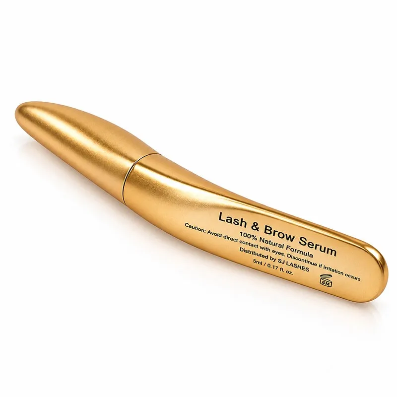
Image title: The seam sits at the widest point — the hardest place to hide a mismatch
What 3D printing actually buys you here — and what it does not
The body on this pen is additive, and you can see one reason for it in the photo: there is no parting line along the side of the nose. An injection-moulded tapered shell needs its tool to open somewhere, and on a shape like this the seam would run the length of the taper, right through the most-looked-at curve. Printing removes that.
What it buys:
- No tooling, so the shape is free. Taper, oval panel, bezel and wall thickness can be revised without cutting steel. That is what makes low-volume custom logos viable at all.
- A seam where you want it. The panel and the bezel can be modelled into the shell rather than machined into a tool face.
- Late changes. A radius, a nose length, or a panel width can change between 2,000 and 2,500 pieces without the cost of an insert.
What it does not buy, and what buyers get wrong:
- It does not come out gold. The gold is a post-process: sand, fill, prime, base coat, metallic coat, then the two-finish treatment. On a printed body that sequence is most of the unit cost.
- Layer lines must be gone before the metal goes on. A metallic coat is unforgiving — it magnifies whatever is underneath. Print too coarse and you get brushed metal, whether you wanted it or not; print fine and fill properly and you get the smooth flop in these photos.
- The boundary becomes labour. On a printed part the matte/polish line is a masking step per unit, not a tooled certainty.
- A printed shell is porous. That matters for a liquid cosmetic. Ask what the inner surface is — a barrier liner, a compatible resin, or a coating — because a 5ml alcohol- or water-based serum sitting against a raw printed wall is a formula-compatibility question, not a looks question.
The brush: stem length is a packaging decision
Open this pen and you get a thin black stem ending in a fine tapered tip — a liner brush, not a mascara spoolie. That is correct for a serum applied along the lash line, and it changes the packaging maths in a way most buyers never check.
Stem length must be set against the fill level. A 5ml tube is only about 40mm of usable depth. If the stem is too long, the tip touches the base, bends, and stays bent; the tip then applies at an angle forever. If the stem is too short, the last few millimetres of serum can never be reached, and the customer writes a review about a product that ran out early — when in fact it pooled at the bottom.
The neck is a different material, and it shows. On this pen the threaded neck is black plastic against a gold body, so in the open state the colour story breaks at exactly the moment the customer is closest to the product. Either make the break deliberate — a black collar reads as functional, like a lens mount — or carry the gold down onto the neck.
The tip is the only part that touches skin, so it is the part to inspect on a sample: straight, centred, and the same taper across units. A perfect body with an off-centre tip is a returned product.
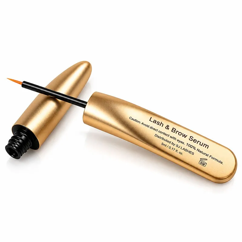
Image title: The break in the colour story, at the closest view
The pouch: iridescence is not a colour, and may not be a barrier
The pack ships in a holographic zip pouch with a hang hole, and it is the most seductive thing in the set — and the one most likely to be chosen for the wrong reason.
Two separate questions, and they get confused constantly.
Is it a barrier? A serum's actives — peptides, panthenol, biotin, plant extracts — are degraded by light, and light is the first thing a holographic film lets you think about last. Holographic effects come from a micro-structured layer, and that structure can sit on a clear film or on a metallised one. A clear holographic pouch is decoration. A metallised holographic pouch blocks light and is a genuine barrier. Same look in a photograph, completely different product. Ask for the film structure and the light transmission, in writing.
Is it a brand surface? No. Iridescence changes colour with the angle, so nothing printed on it holds a colour value, and no two units photograph the same. That means the pouch cannot carry a brand colour — it can only carry a brand effect. If your identity depends on a specific gold, the pouch will fight it.
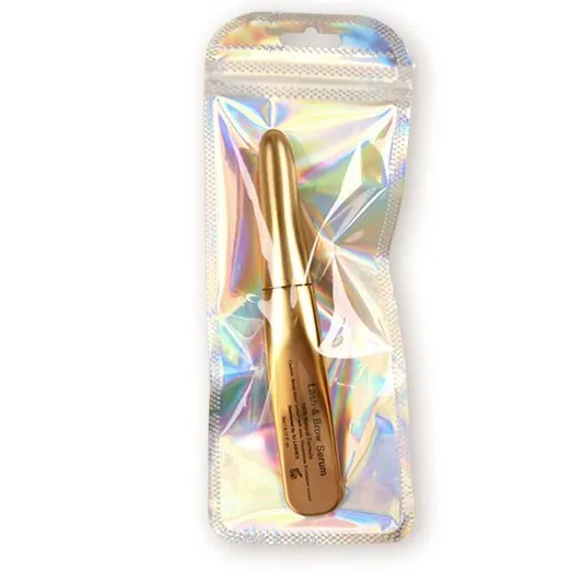
Image title: A surface that cannot hold a colour — but can hold a hang hole
And the hang hole tells you what this pouch is for: it is a shelf pack, not a transit bag. A euro-slot means the product is meant to hang on a peg in a store, which means the pouch is customer-facing, which means its border is the only flat, printable, opaque area on the entire pack.
Where the legal block goes
A 5ml pen has no room. The panel carries a product name, a formula line, one warning sentence, a distributor name, the volume and a small icon — and it is already full. There is no version of that panel that also holds an ingredient list, a batch code, a date, a PAO symbol and a responsible-party address at a readable size.
So the carrier has to be decided before the artwork:
| Carrier | Room | Relative cost | Note |
|---|---|---|---|
| Pouch border / back panel | moderate | lowest | only if the film is printed and opaque enough to read on |
| Printed card in the pouch | generous | low | can be lost before the sale, but is the most flexible |
| Small carton | most | highest | best for retail, worst for a hang-pack |
One number on this label is worth praising: 5ml and 0.17 fl oz are consistent. 5ml converts to 0.169, so the rounding is correct. That is rarer than it should be — a mismatch between volume and fluid ounces is the kind of thing a customs officer or a picky customer finds before you do.
Supplier scorecard
What to ask
- How are the two finishes produced — mask and coat, two tool faces, or polish-then-dull?
- Is the panel recessed, flush, or proud?
- Are body and cap finished in the same batch, in the same rack?
- What is the finish difference tolerance between body and cap, and is it measured or asserted?
- What is the inner surface of the printed body, and what is it compatible with?
- What is the pouch film structure, and what is its light transmission?
- Is the pouch printed, and on which panel?
- Which carrier holds the ingredient list, batch, date and PAO?
- What are the brush stem length and the fill level, and do they meet?
- Custom logo: is it printed, laser-etched, or a decal — and where does it go if the panel is already full?
What to test
- The ring. Cap on, one lamp, look along the seam. Compare a unit from week one with a unit from week four.
- The panel under raking light. Any mask line, crazing or step will show only at a low angle.
- The pouch in sun. Two days on a windowsill, then check the serum colour against a stored control.
- Fill and reach. Fill to spec, use it dry, and see how much is left at the bottom.
- The tip, ten units. Straight, centred, same taper.
- A drop test in the pouch. The pouch is the pack — test the pack, not the pen.
Quote checklist
- Body: material, print process, wall thickness, panel geometry, recess depth
- Finish: matte system, polished system, number of coats, masking method
- Cap: length, weight, finish batch linkage to the body
- Neck: material, colour, thread spec, seal
- Brush: stem length, tip material, tip taper, insertion depth
- Fill: 5ml, and the declared temperature
- Label: which elements are printed on the pen, which on the carrier
- Pouch: film structure, thickness, print, hang-hole spec, zip type
- Carton or card, if used
- Samples: minimum one finished pen inside its real pouch
- Lead time, and which component is the critical path
Compliance and honest claims
The packaging decides what you can legally say, so a few of these belong in the pack brief rather than the marketing plan.
- "100% Natural Formula" is the highest-risk line on this panel. Under current green-claims rules a percentage claim of this kind must be substantiated for the whole formula — including preservatives, solubilisers and pH adjusters, none of which are natural. If any ingredient is synthetic, the claim is not a rounding error, it is a false statement. "Plant-based complex" or naming the actives is safer and more specific.
- A serum may not promise to grow lashes. Cosmetic serums can condition, hydrate and improve the appearance of density. Growth is a drug claim in most markets. The product name "Lash & Brow Serum" is fine; the copy around it is where the risk sits.
- The caution line is doing real work. "Avoid direct contact with eyes" is appropriate for a lash-line product and should not be softened for aesthetics.
- The panel is not the label of record. Ingredient list, batch, date, PAO and responsible party have to live somewhere readable — that is what the pouch border, the card or the carton is for.
- 5ml is a volume. Declare it as volume at a stated temperature, and keep the fl oz conversion consistent with it.
- Recyclability needs the whole pack. A printed shell plus a metallised pouch plus a card is a mixed pack; a claim has to cover all three, not the most convenient one.
Why SJ LASHES
A gold cosmetic pen is decided by things a render cannot show: whether the cap still matches the body after a month, whether the mask line on the panel is straight under a shop light, and whether the serum is still the same colour inside the pouch.
- We treat the two finishes as one process, not two line items, and we tell you which method we are using and what it costs in labour.
- We match body and cap in the same finish batch, because that is the only way the seam stays invisible.
- We build the panel into the shell where the volume allows it, so the window is geometry rather than tape.
- We specify the inner surface against your formula, because a printed body is porous until someone makes a decision about it.
- We test the finished pen inside its real pouch, on a shelf, in daylight — the pack the customer receives, not the pen on the white sweep.
FAQ
Can the whole pen be polished gold instead? Yes, and it will look cheaper in the hand. A fully polished tube shows every fingerprint, every bag scuff and every handling mark within a day of use. The matte field is what makes the product survive being owned.
Can the logo be larger? On this length, the panel is already close to the maximum that still leaves the nose and shoulder clean. A larger panel eats the taper and the pen stops reading as a pen. If the brand needs more space, put it on the pouch or the card, where space is not a compromise.
Is printed or laser-etched better for a small logo? Printed holds fine detail and colour; laser-etched is more durable and reads as a light mark on gold, which is elegant but lower contrast. On a polished panel, print wins for legibility. On the matte body, laser can work as a subtle secondary mark.
Why is the neck black? Functionally it is a different material with a different job — it seals and it holds the brush. Visually it is a break. Make it deliberate with a crisp edge, or carry the gold down; what fails is a break that looks accidental.
Can the pouch be clear so the pen shows through? It can, and it will look good in a photo and fail as a barrier. Light is the enemy of a serum's actives. If you want to see the product, use a clear window on an opaque metallised film rather than a fully clear pouch.
What is the minimum order for a custom logo? That depends on whether the body geometry changes or only the artwork. Artwork on an existing shell is a print change; a new panel shape means a new print orientation, a new mask, and usually a new minimum.
The takeaway
Do not design a gold pen and then look for somewhere to put the type. Design the place where the type can be read, and make everything else support it.
That is what this pack did. A matte body that survives the hand, a polished window that gives black letters a surface to sit on, a recess to protect the polish, and one finish batch so the cap never betrays the body. Get those four right and a 5ml pen looks like it cost three times what it did.